
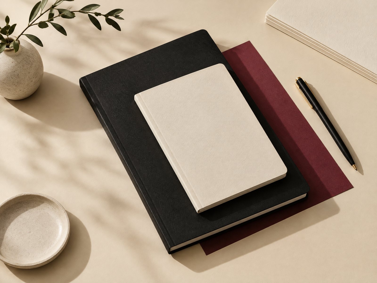
A black-and-ivory notebook can look considered on Monday and strangely unfinished by Friday: a red pen appears, then a blue tab, then a cheerful sticker sheet, until the page has no visual decision left. If you want a notebook that stays quiet while still having a point of view, Farouk Book Store offers a useful starting frame: keep the notebook monochrome, then introduce one deliberate accent color. The goal is not a generic desk palette or a pile of coordinated supplies. It is a small editorial capsule in which contrast, scale, and repetition do the work.
This approach suits a reading notebook, project log, or everyday pages where the writing should remain primary. Think of black, white, and ivory as the structure; the accent is a signal. It might mark a new section, give a cover a focal point, or make one small image feel intentional. Because Farouk is a shop with an editorial selection rather than the asserted manufacturer of every catalog design, treat the products below as pieces to evaluate together, not as a single branded collection made by one studio.
Start with the notebook’s quiet base
Before choosing burgundy, rust, cobalt, or another single color, decide what “monochrome” means in the actual notebook. A black cover with bright white pages behaves differently from an ivory cover with charcoal lines. Photograph the notebook in the light where you use it and look for its existing undertone. Warm ivory makes a muted red feel softer; stark white makes the same red feel sharper. This small check prevents the accent from fighting the paper before you have even added anything.
The Journals & Notebooks collection is a practical place to browse the base object and its neighboring formats. One concrete option is the Botanical Bliss Spiral Lined Notebook, listed as a 7 x 9 inch softcover notebook with 120 lined college-ruled pages and a spiral binding that allows the pages to lie flat. Its floral-inspired cover is not a blank monochrome surface, so use it as a test case rather than assuming it fits the edit: if its existing color is already dominant, choose a restrained accent that echoes a small detail instead of adding a competing hue.
If the notebook already contains a strong pattern, reduce the accent’s job. Let it appear in a thin marker line, one tab, or a single cover-side object. If the cover is genuinely spare, the accent can carry more weight, perhaps as a narrow band on a title page or one recurring symbol at the start of each section. The adjustment is simple: the busier the base, the smaller and less frequent the accent should be.
Choose one accent by contrast, not mood alone
“Burgundy” sounds specific, but color names are slippery on screens. Choose by relationship: is the accent darker than the ivory, warmer than the black, or bright enough to pull attention from handwriting? A muted burgundy gives a low-key contrast against cream. A vivid red becomes a focal point immediately. A pale blush may disappear beside warm paper and require repetition to read as intentional. None is automatically better; each changes the hierarchy of the notebook.
Make three paper swatches using whatever you already own. Place each beside the notebook, then view the group from a few feet away. The right choice should register as one clear note rather than a new color family. If you can see several near-duplicates competing—brick, coral, pink, and orange—discard all but one. The most common failure is not choosing the wrong color; it is allowing a near-match to multiply until the “single accent” becomes a loose spectrum.
A useful rule is one accent, two values at most. For example, pair a deep burgundy cover mark with a paler version used only for a tiny index flag. Do not add gold merely because it feels decorative, or green because it appears in a plant illustration. Those may be attractive choices for another edit, but they change the brief. The monochrome capsule works when the eye can identify the accent quickly and then return to the page.
Control motif scale and visual weight
Color alone does not make a coherent edit. A tiny accent repeated six times can feel busier than one large accent used once. Decide whether your notebook needs a micro-motif, a medium focal piece, or a single larger interruption.
A micro-motif is useful for navigation. Draw a small burgundy square on the first page of each project, or use one small mark in the outer margin. Keep the mark identical so it becomes a signpost rather than decoration. This is a good choice when the notebook is mainly lists and notes.
A medium focal piece works on a divider or inside cover. The Study Break Cute Art Print is an actual 5 x 7 inch, single-sided soft-touch cardstock print in the catalog. It could sit beside a notebook as a reference card or be framed near the writing area, but do not describe it as a notebook insert unless you have checked the fit and intend to trim or mount it. Its scale is large enough to become the visual anchor of a small arrangement, so pair it with plain black and ivory rather than another illustrated object.
A larger interruption is appropriate only when the notebook has enough empty space to absorb it. If the cover, first page, and desk are all patterned, a large accent will make the edit feel crowded. Reduce it to a corner detail. Conversely, if the pages are stark and the notebook feels anonymous, one prominent card can establish the capsule faster than many tiny additions.
The Study Night Cute Art Print offers another catalog example at the same 5 x 7 inch format. Choosing between the two should be based on the image’s actual dominant color and the space around your notebook, not on an assumption that both belong in one arrangement. Use one as the focal piece and keep the other for a separate edit. Coherence often comes from leaving an appealing item out.
Build the capsule, then edit it down
Lay out the notebook, one writing instrument, one accent object, and one neutral support on a clear surface. The support might be an ivory card, a black clip, or an unprinted sheet. Step back and ask four practical questions:
- Can I name the accent color in one word?
- Does the eye land on the notebook before the accessory?
- Is the accent repeated for a reason, such as section marking?
- Would removing one item make the arrangement clearer?
If the answer to the last question is yes, remove it. This is not minimalism as a rule; it is editing for a specific capsule. A monochrome notebook may need only a single colored card at the front and a matching mark at the back. Adding a second illustrated print because it is attractive can create two focal points and make the notebook look like a display rather than a working object.
Test the capsule in use for one short session. Write a page, turn to a new section, and close the notebook. Watch for practical friction. A large card may slide out, a dark accent may make small handwriting harder to read, or a vivid tab may pull attention from every page. Adjust the role rather than abandoning the concept: move the card to a nearby shelf, reserve the color for section openings, or reduce the mark to a narrow edge.
The Botanical Bliss notebook’s listed page size and lined format also make it a useful reminder to distinguish visual planning from fit claims. Do not assume every card, print, or accessory belongs inside a 7 x 9 inch notebook without measuring. If you need a reference object outside the book, keep it beside the notebook. If you need a page marker, choose a slim, removable piece and leave the writing area clear.
Three finished directions to try
Quiet burgundy index. Use a black or ivory notebook as the base, one muted burgundy pen or paper swatch, and a small burgundy mark at each major section. Keep the cover bare. This direction is best when the notebook will travel or hold work notes, because the accent helps navigation without turning every page into a collage.
Single-card focal point. Place the notebook on an ivory surface with one 5 x 7 inch art print nearby, choosing either the Study Break or Study Night option after checking its visible colors. Keep all other objects black, white, or neutral. The print is the visual event; do not repeat its motifs across the notebook unless you can do so with one very small mark.
Monochrome cover, colored opening page. Let the exterior remain black and ivory, then introduce the accent only on the first spread of each new project. Write the project name in black, add one colored underline, and leave the rest of the page open. This direction protects the notebook’s quiet exterior while giving each section a controlled entry point.
A failed version usually reveals the fix. If the accent disappears, increase contrast or repeat it at two deliberate locations. If it dominates, reduce saturation, shrink the motif, or remove half the repetitions. If the notebook feels too severe, add texture through paper rather than another color: a soft-touch print, a matte card, or the tactile contrast of the notebook cover can create interest while preserving the one-color rule.
Farouk’s catalog can support this kind of selective browsing: begin with the notebook format, identify one color relationship, and then stop when the capsule is complete. For a practical second opinion about proportions, see the existing notebook size guide before placing cards or accessories around a book. For page planning without turning the edit into a generic color exercise, creative notebook sections offers another useful point of reference. If the arrangement will live on a small work surface, small desk color palette can help you judge the surrounding area separately from the notebook itself.
The strongest result is not the most decorated notebook. It is the one where black and ivory create a calm frame, one accent tells the eye where to look, and every included object has a job. Start with less, test the capsule in real use, and let contrast and scale—not an ever-growing pile of supplies—make the decision visible.
If you need help selecting a format or checking a current item, contact Farouk Book Store.
Related reading: Notebook Size Guide, Creative Notebook Sections, and How to Choose a Color Palette for a Small Desk.