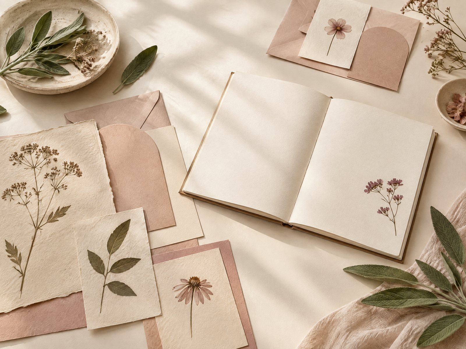
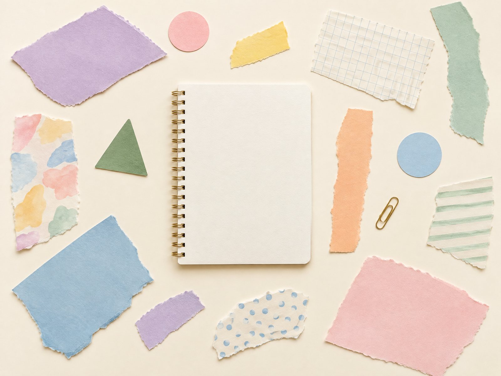
You like the look of a finished collage, but you do not want one wrong placement to own the page forever. Perhaps the notebook is useful for lists as well as decoration, or the design needs to work for a gift that should feel considered rather than overworked. Farouk Book Store offers a practical starting point: treat the shop's sticker selection as an editorial palette, then build the image in stages so the arrangement can change before anything is fixed.
A reversible paper collage is not a promise that every adhesive will peel away perfectly. It is a planning method. You arrange loose pieces, photograph the version you like, and keep unused or removable elements in pockets until the composition earns a permanent place. The result can be a notebook spread, a card front, a folder insert, or a small paper scene that remains adaptable to the surface and its purpose.
Start with a surface that can change jobs
Choose the destination before choosing the motif. A notebook page used for daily writing needs a generous quiet zone; a card front can carry more visual density because its job is primarily to be seen. A folder or dashboard may need pieces that can be moved when the contents change. If you begin with a vague idea of “decorating,” it is easy to fill every open area and discover later that the surface no longer works.
Place a sheet of plain paper over the intended page and mark three things lightly in pencil: the area that must stay readable, the edge that may be trimmed, and the corner where a hand will naturally touch. This temporary template gives you a boundary without committing to the original page. For a 7-by-9-inch notebook such as the Botanical Bliss Spiral Lined Notebook, reserve a clear band for writing rather than treating the full cover or page as a canvas. The notebook’s listed lined format makes that distinction useful: a collage can frame notes without competing with them.
Next, decide whether the collage is meant to be seen flat, opened, or handled repeatedly. A flat card can support a focal sticker near the center. An opening notebook benefits from a visual weight that does not sit directly in the fold. A frequently handled folder should use fewer raised or delicate pieces. These are design decisions, not rules about taste; the right amount of paper is the amount that leaves the object usable.
Build three loose versions before choosing one
Work on a clean sheet, not on the final surface. Gather a small set of pieces: one focal shape, two or three supporting motifs, and one neutral or blank paper element. Limiting the first batch prevents the familiar failure mode of having too many attractive options and no hierarchy. Keep the pieces face up, and move them with a paper clip or tweezers if the edges are small enough to crease under your fingers.
Make three arrangements with distinct purposes:
- Frame: place the focal piece toward one side and let smaller marks guide the eye around an open center. This works when the collage must leave room for handwriting.
- Cluster: group pieces in an uneven but contained island. Use this for a card, divider, or cover where the composition itself is the message.
- Trail: create a diagonal or gentle path with visible gaps between pieces. This gives a narrow surface movement without turning the entire page into a pattern.
Do not decide by looking only at close range. Slide each version into the notebook, stand it upright, and view it from arm’s length. A cluster that feels balanced on the desk may become a heavy block beside a page of text. If one piece dominates, first move it farther from the center before removing it. If the collage feels scattered, bring two supporting elements closer together rather than adding a fourth motif.
For a conversational paper edit, the Penpal Snail Mail Aesthetic Matte Sticker Sheet can supply a coherent group of small mail-themed marks. Its listed 4-by-6-inch sheet and 14 individual stickers make it suited to sampling several arrangements, but you do not need to use all of them. Select one envelope-like mark as the focal point, then test two smaller accents at different distances. The shop is presenting a catalog choice here, not claiming to manufacture every design on the site; let the item’s stated format guide your planning, while your own composition makes the final decision.
Photograph the layout, then make a pocket for the alternatives
Once you have a promising version, photograph it before applying anything. Take one overhead image with the full template visible and one closer image that shows spacing and orientation. Include a small paper label outside the composition—“frame,” “cluster,” or “trail”—so several attempts do not become indistinguishable in your camera roll. A phone photo is enough; the point is to preserve a reference, not create a polished product image.
Photographs reveal problems that the eye excuses during arranging. Look for accidental tangents, where one edge appears to grow directly out of another. Check whether similarly sized pieces form an unintended row. Notice whether the visual center is too close to a fold, a writing line, or a thumb position. Correct one variable at a time and photograph again. If you change color, scale, and spacing together, you will not know which adjustment solved the problem.
Now make a loose pocket for everything not currently selected. Fold a piece of plain paper into a shallow sleeve, or use an envelope kept beside the notebook. Mark the outside with the project name and the date of the photograph. Keep the unused pieces flat and separate from scraps, receipts, and adhesive backing. A pocket turns revision into a normal step: you can swap a motif when the page’s purpose changes instead of treating the first draft as a failure.
The Cloudy Skies Aesthetic Sticker Sheet is an example of a useful secondary palette when you want atmosphere without adding a new subject to the scene. Test one cloud-like mark as negative-space support rather than scattering every piece across the page. If the cloud shapes make the focal motif feel too low-contrast, return them to the pocket. A reversible project is successful when rejecting an option is easy.
Commit in small stages—or keep it loose
Before adhesive, make a final mock-up on the actual surface using low-tack removable notes, a small paper clip, or a strip of scrap paper placed beneath an edge. This is the last check for scale and use. Open and close the notebook. Write a short line in the reserved space. Slide the card into its envelope if it is a card project. If a piece catches, blocks text, or makes the object awkward to handle, adjust now.
When you are ready to commit, start with the least important supporting piece, not the focal piece. That creates a visual anchor while preserving the central decision. Apply only the adhesive appropriate to the material and surface, following its directions; do not assume that a sticker advertised for one smooth object will behave the same way on every paper, coating, or fabric. Press from the center outward to reduce wrinkles, then pause and inspect the edge before adding the next element.
Some projects should remain fully loose. A pocketed collage can be a changing bookmark kit, a seasonal dashboard, or a set of paper pieces chosen for different pages. The Stickers collection is useful for browsing possible motifs, while a loose pocket lets you use the same small edit in more than one notebook. If a piece is precious, irreplaceable, or difficult to remove, place it on a separate card inside the pocket rather than taking a risk on the final surface.
A common failure is “finishing” too quickly: the maker sees a blank corner and fills it, then compensates for the new weight by adding another piece, until the original focal point disappears. The adjustment is subtraction. Return to the photograph of the earlier version, remove the newest addition, and live with the quieter arrangement for a day. Another failure is planning only from the front. A piece may look balanced when closed but sit directly beneath a thumb when the notebook opens. Photograph both states and keep the more functional one.
A third failure is confusing reversibility with careless placement. Loose does not mean messy. Store pieces in labeled pockets, keep the reference image with the project, and write a two-line note about what the collage is meant to leave open. That record makes it possible to rebuild the composition after a move or replace one motif without starting from zero. For questions about a listed item or a possible order, use Farouk Book Store’s contact page; availability and order details should be confirmed rather than assumed from a draft layout.
A reversible collage succeeds when the paper object keeps its original job. The writing area remains readable, the card still closes, and the folder still holds what it needs to hold. Use the photograph as a guide, not a command. You may keep the exact version, exchange one accent from the pocket, or return every piece and start with a different surface. The value is in having choices after you begin.
Before storing the project, record three decisions: the selected focal piece, the amount of open space you protected, and the condition that would make you revise it. “Change the corner if the writing moves there” is more useful than “make it prettier.” This small note keeps the collage connected to real use instead of turning it into a one-time arrangement that cannot adapt.
Farouk Book Store’s about page provides a place to understand the shop context behind the catalog. For this project, that context is simple: browse an editorial selection, choose actual items that suit your paper plan, and give yourself permission to test before you stick. A collage can be expressive without being irreversible, and a careful pause before adhesive is often the most creative move on the page.
Related reading: How to Layer Clear Stickers on Journal Pages, How to Choose Stickers for Journals and Planners, and Best Stickers for Scrapbooking: A Creative Guide.