Clear stickers are useful when you want decoration that sits lightly over a journal page instead of covering it completely. When you layer clear stickers, the page can gain depth from overlapping shapes, lettering, and small details while your date, notes, or sketches remain visible underneath. The key is to plan the order before pressing anything down: start with the largest or quietest element, leave room for writing, and use smaller pieces to connect the composition.
This method works for a daily journal, reading log, travel spread, scrapbook-style page, or planner dashboard. You do not need a perfectly empty page or a matching sticker set. A few intentional overlaps can make unrelated designs feel like one layout, especially when you repeat one color or place similar shapes along the same visual path.
Prepare the page and choose a simple visual plan
Begin with the page itself. If you are decorating a spread that still needs writing, lightly mark the areas reserved for your entry with a pencil or place removable notes over them. Think in zones: a title area, a main image area, and one or two small accents. This prevents a beautiful sticker cluster from taking over the space where you planned to record something important.
Next, choose a focal point. It might be a large moon, a window, a flower, a label, or a prominent word. The focal sticker does not have to be the biggest piece, but it should be the first thing you notice. Put it slightly off-center rather than directly in the middle if you want the page to feel more relaxed. Then identify a supporting sticker that can overlap one edge without hiding the focal image.
A useful three-part plan is:
- Base: one broad, quiet shape or border that establishes the area.
- Middle: a recognizable illustration or phrase that gives the cluster meaning.
- Top detail: a small star, heart, spark, dot, or label that finishes the overlap.
Lay the stickers on their backing paper first. Move them around without peeling them up. Take a quick phone photo of the arrangement if you are working with a limited sheet. This test catches problems early, such as a title hidden under a large shape or two dark designs touching and forming one heavy patch.
For a coordinated starting point, browse Farouk Book Store’s stickers collection. A real example is the Dreaming Window Aesthetic Cute Vinyl Sticker, whose compact window illustration can serve as a focal image in a small corner. It is listed as a vinyl sticker with a matte finish, so treat it as a separate opaque accent when planning a clear-sticker layer rather than assuming it will behave like a transparent overlay.
Build the layers from quiet to noticeable
Once the arrangement feels balanced, apply the pieces in an order that protects the visual hierarchy. Place the sticker that should sit farthest back first. Press only the center at the beginning, then smooth outward with a clean fingertip or the flat edge of a card. This gives you a moment to notice a wrinkle before it becomes part of the finished cluster.
Add the second layer so it overlaps only a portion of the first. A narrow overlap often looks more deliberate than covering half of an image. For example, let a clear botanical outline cross the lower corner of a pale label, then place a tiny accent at the crossing point. The eye reads the intersection as a connection, while both designs remain identifiable.
With clear stickers, the page underneath affects the result. A handwritten sentence may show through one layer clearly but become difficult to read beneath two or three printed areas. Keep text zones under the least busy parts of the design. If a clear sticker has lettering, place it over open paper or a light background when you want the words to remain easy to read.
Use a simple depth sequence for a journal corner:
1. Place a wide clear border or translucent shape near the edge of the page. 2. Add a medium illustration so it crosses the border slightly. 3. Put a small accent over one corner of the illustration. 4. Stop and view the page from arm’s length before adding anything else.
That last pause matters. Layering can become crowded one small piece at a time. If the composition already has a clear focal point, a blank margin may do more for the page than another sticker. You can also leave one side of the cluster open, creating a visual direction toward your journal entry or page title.
Balance color, transparency, and writing space
Transparency does not automatically make a sticker visually light. Several clear pieces with strong outlines, saturated colors, or dense lettering can still create a dark area. Look at the total cluster rather than judging each sticker by itself. If the upper-left corner is colorful, keep the lower-right accent simpler. If the page has black ink, repeat that ink color in one small sticker detail so the decoration feels connected to the writing.
A practical color rule is to choose one main color, one supporting color, and a neutral such as black, white, gray, or the paper tone. For a blue reading log, you might combine a blue window or cloud, a small warm accent, and clear lettering. For a brown-and-cream morning entry, a clear label with dark text can sit over the page while a tiny colored icon provides the only bright note.
Do not place transparent stickers over every line of writing. Instead, use them where the page can show through: in the margin, across a blank area, around a heading, or at the edge of a block of text. If you want an overlay effect across a sentence, choose a sticker with open space and check that the words remain readable before committing.
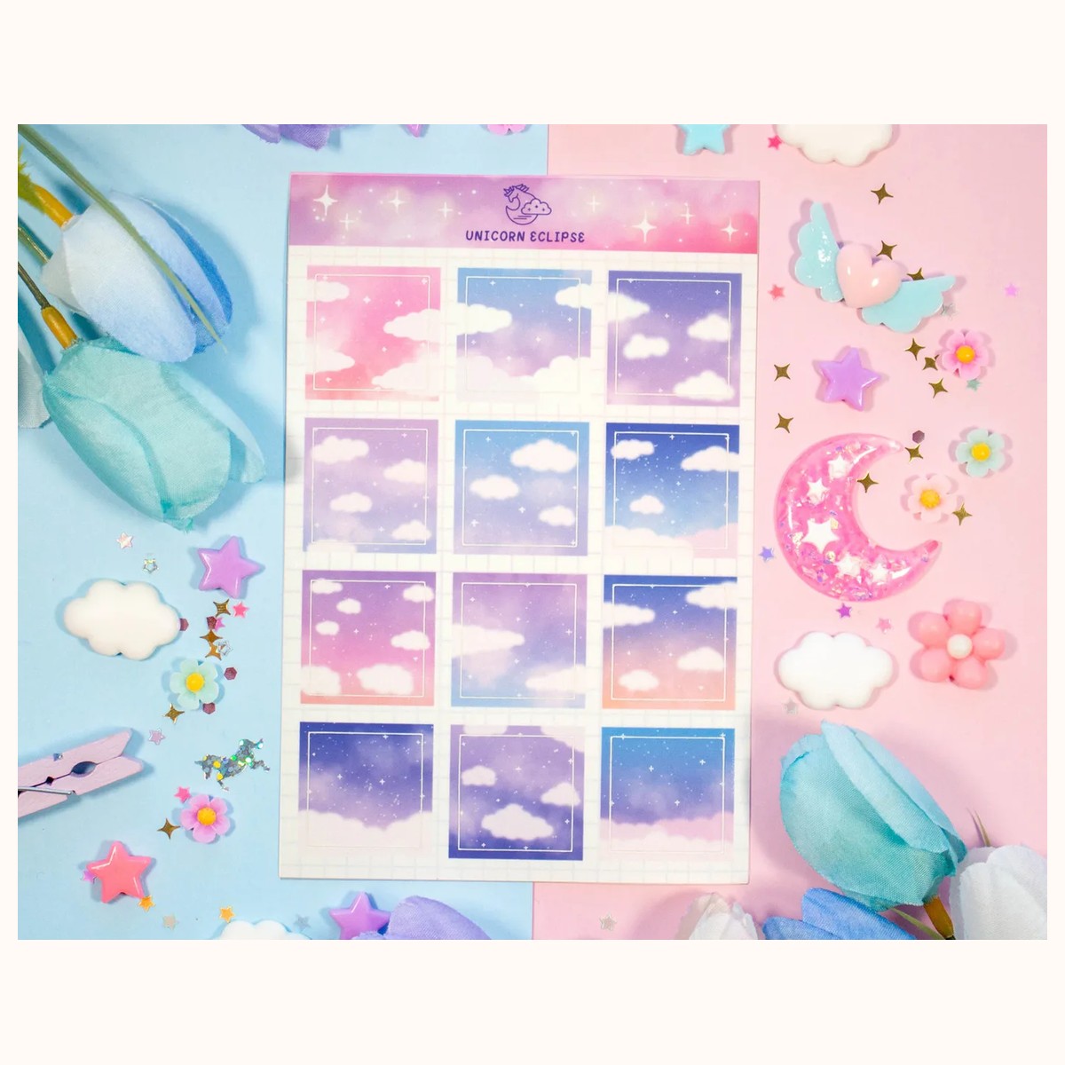
The Cloudy Skies Aesthetic Sticker Sheet is another catalog example for planning a layered mood. Its listed sheet includes individual cloudy designs with a soft matte look. Because the product description does not identify the stickers as clear, use the sheet as an opaque supporting layer or border element, and reserve true transparent pieces for the see-through parts of your design. This distinction helps you avoid expecting one material or finish to behave like another.
For a full-page spread, repeat a motif instead of repeating the same sticker. A cloud at the top, a small star near the date, and a curved accent near the bottom can guide the eye without making the layout symmetrical. If you are decorating both pages, allow one element to cross the gutter only if the journal can lie flat enough for you to place it accurately. Otherwise, keep the main cluster on one page and echo its color on the facing page.
Troubleshoot lifting, wrinkles, and crowded overlaps
If a clear sticker lifts at a corner, avoid rubbing it repeatedly with a fingernail. Smooth the corner down with a clean, dry fingertip and check whether the page has dust, loose fibers, or a fold in that area. When the page surface is textured or the sticker has already collected debris, moving the entire composition may be cleaner than forcing the edge to hold.
For a wrinkle, pause before adding the next layer. If the sticker can be lifted without tearing the page, raise it slowly from one corner and reposition it with less tension. Do not assume every sticker can be removed cleanly; test a spare or an inconspicuous edge first, especially on a delicate journal page. When repositioning is not practical, turn the wrinkle into a visual boundary by placing a small accent beside it rather than directly over it.
If two layers look muddy, identify which one is doing less useful work. Remove or cover the smaller piece only if doing so will not hide writing or damage the page. A clear sticker that disappears completely may be better moved to a blank margin, where its outline can be seen, or saved for a lighter page. Layering should create separation and interest, not simply increase the number of stickers.
If the page feels unbalanced, take a photograph and view it in black and white. You do not need a technical tool; most phone photo editors have a monochrome option. The image can reveal whether one corner is too dark or whether the focal point is actually competing with a bold title. Then make one change at a time: shift a small accent, add a matching mark on the opposite side, or leave the page as it is.
Finally, let the ink and decoration work together. Write first when the journal entry is the priority, then layer around the finished text. Decorate first when the page is mostly visual and you know where the lettering will go. In either case, keep a few unused stickers nearby. A leftover tiny detail is often more useful for correcting balance than a second large illustration.
Clear-sticker layering is most successful when it supports the page’s story. Start with a reserved writing area, test the composition on the backing sheet, build from quiet to noticeable, and stop before every gap is filled. With that process, even a small group of stickers can give a journal page depth while keeping the words and the person who wrote them at the center.
Related reading: How to Choose Stickers for Journals and Planners · Vinyl vs. Paper Stickers: A Complete Guide · Best Stickers for Scrapbooking: A Creative Guide