A small stationery gift can be hard to choose when “cute” is too vague and a person’s taste is not yours to guess. Food imagery offers a useful starting point: coffee may recall a shared morning, fruit may echo a favorite color, and a sweet treat may simply fit someone’s playful desk. At Farouk Book Store, approach these designs as an editorial selection of paper goods and accessories, then choose by a real association and a visual style rather than by stereotypes about who someone is.
The goal is not to assemble every snack-shaped design in one parcel. It is to identify one visual idea, give it room, and make the finished gesture feel intentional. A recipient who dislikes coffee might still like a warm brown palette; someone who loves desserts may prefer one quiet icon over a busy collage. The most considerate choice is the one that leaves space for their actual preferences.
Start with the association, not the assumption
Before browsing, write down one answer to a simple question: “What does this person already connect with this food?” The answer might be a café where you meet, a citrus color they use often, a family ice-cream tradition, or a recurring joke about needing a snack during study sessions. If you cannot name a specific connection, choose based on a neutral visual preference instead: bright versus muted, illustrated versus minimal, or one motif versus a repeated pattern.
This distinction prevents a common failure. A coffee design can feel thoughtful for a friend who sends you café recommendations, but arbitrary for a recipient who never drinks coffee. A fruit design should not be presented as evidence that a person is “sweet,” “fresh,” or any other personality label. Food is a visual language and a memory prompt, not a personality test.
Use a quick three-part filter:
1. Association: What detail makes the motif relevant to this person or occasion? 2. Style: Would they choose cheerful color, soft neutrals, bold outlines, or tiny repeated icons? 3. Use: Where will the paper item go—journal margin, letter, planner, laptop, or gift wrap?
If only the first answer is strong, keep the selection small. If the association is uncertain but the style is clear, let color and scale do the work. This keeps the gift personal without pretending to know more than you do.
Three food-motif directions to compare
Coffee: familiar, graphic, and easy to keep restrained
Coffee motifs often carry a recognizable café vocabulary: cups, takeaway shapes, warm browns, cream, and occasional handwritten-style details. They work well when the recipient likes a cozy or graphic look, but the edit can quickly become repetitive. Pick one anchor rather than stacking cups, beans, menus, and café signs together.
The catalog’s Iced Coffee Aesthetic Cute Acrylic Charm Keychain is an accessory rather than a paper sticker, so it can serve as the single dimensional focal point on a gift. Pair it with a plain note or an understated paper accent, not a second large drink illustration. For a paper-led option, Coffee Shop Kawaii Aesthetic Washi Tape can mark an envelope edge or create a short band on a card. Use one strip and leave visible margin; the empty space makes the motif feel selected rather than scattered.
A failure case is a “café overload” parcel: brown wrapping, coffee tape, a mug illustration, and a message about caffeine all at once. The visual joke may obscure the actual gesture. Adjust by retaining the coffee cue in one place and changing the support color to ivory, pale blue, or another shade the recipient already uses.
Fruit: color-first and naturally adaptable
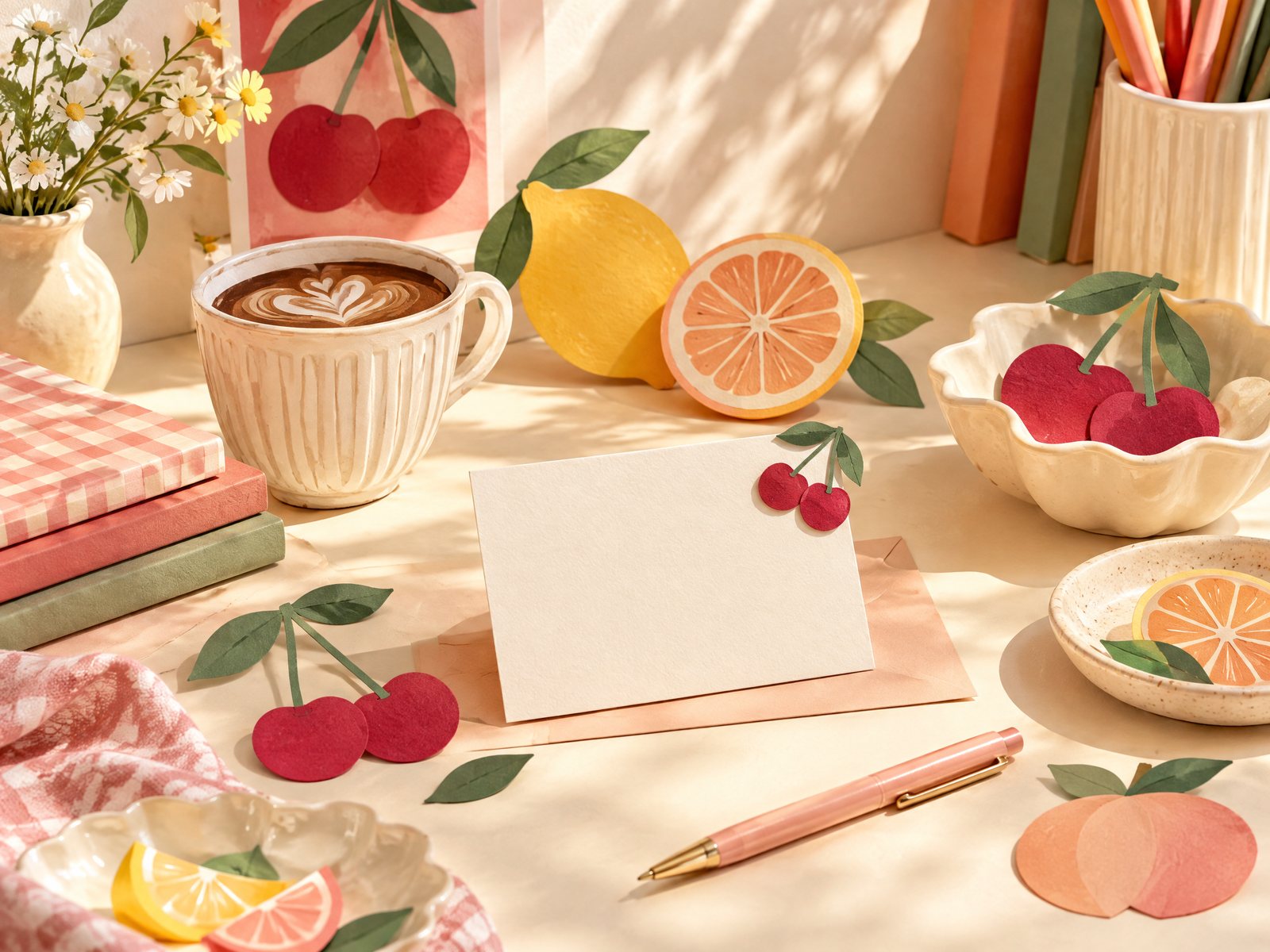
Fruit motifs are useful when the strongest clue is color. Red cherries, yellow citrus, or green pears can connect with a favorite notebook cover, a kitchen memory, or a lively wardrobe without requiring the recipient to identify as anything. They also offer a clean way to build contrast: one saturated color against a quiet paper background.
Keep the fruit edit deliberate. Choose one fruit family or one dominant hue, then add a neutral card or envelope. If you combine several fruits, make their scale similar and let one color repeat twice; otherwise the arrangement can resemble a random market basket. The Stickers collection is a practical place to compare paper motifs while keeping the project centered on stickers rather than drifting into unrelated accessories.
Try a small composition: one fruit accent in the top corner of a note, a second near the closing, and no decoration in the middle where the message needs breathing room. On a journal page, place the motif beside a date or a short memory rather than over a paragraph. If the recipient prefers quiet design, reduce the number of accents before reducing the color; one vivid mark can look more considered than several pale ones.
Sweet treats: playful, but not automatically childish
Popsicles, pastries, and candy-shaped imagery can be bright and humorous, yet the same motif can read differently depending on line weight and palette. A simple outline in muted colors may suit an adult planner. High-contrast colors and repeated tiny icons may be right for a playful scrapbook. Let the recipient’s existing stationery answer that question.
The Popsicle Cute Aesthetic Vinyl Stickers offer a clear sweet-treat direction with a single recognizable shape. Because the catalog listing presents color options, choose the color that connects to the recipient’s materials instead of treating the product name as the entire concept. One sticker can mark a reading note, decorate a pencil case, or finish a small paper parcel; the use should be decided before buying several.
A common miss is sending a sweet-treat motif to someone who enjoys minimalist pages because the giver likes the joke. The adjustment is simple: choose one sticker as a tiny surprise, or skip the motif and use the recipient’s preferred color in a more restrained design. A food theme should create delight, not create a decorating task they did not ask for.
Build a coherent mini-edit
Once you have a direction, limit the selection to one focal item and one or two supporting elements. A focal item carries the recognizable food image. A supporting element supplies writing space, a border, or a small repeated mark. This ratio works for a gift, a journal page, or a desk vignette because it gives the eye a clear destination.
Use scale as the organizing tool. A large coffee charm can stand alone with a blank note. Several small fruit stickers can share a page with a plain envelope. A busy sweet-treat pattern needs more whitespace around it than a single outline. Avoid matching everything exactly; repeating one color or one shape is usually enough to make the edit feel connected.
Material also changes the mood. Matte paper tends to read softly and photograph with less glare, while a glossy or acrylic element becomes a visual punctuation mark. Do not describe the shop as the manufacturer of every design: Farouk Book Store is the place to browse and select from its catalog. Check the individual listing for the item’s stated material, size, finish, and color details, since those specifics determine whether it suits a notebook page, envelope, or everyday accessory.
Before finalizing, lay the pieces beside a blank card and ask three practical questions:
- Is there enough unoccupied space for a message or the recipient’s own notes?
- Does one motif clearly lead, or are all the elements competing?
- Would the recipient recognize the association without needing an explanation?
If the answer to the last question is no, that is not automatically a problem. A visual choice can be quietly personal. Add a short, concrete note—“This reminded me of our Saturday coffee walk”—rather than a broad claim about their personality.
Adjust the gesture to the recipient and occasion
For a colleague or casual acquaintance, keep the food reference light: one coffee-colored tape accent or a single fruit sticker on a plain note. The design can be friendly without implying intimacy. For a close friend, add the specific memory in writing and let the motif remain the supporting detail. For a journaler, prioritize removable or page-friendly paper accents; for someone who decorates bags or keys, a charm may make more sense than a sticker sheet.
Pay attention to preferences you already know. If the recipient avoids clutter, choose one item and a quiet package. If they enjoy maximal pages, a small coordinated cluster can be welcome, but still give it a color rule. If you are unsure about surfaces, do not promise that an item will suit a particular object; use it on paper or leave the placement to them. The washi tape collection can support a paper-only edit when you want a flexible accent without committing the recipient to a permanent surface.
Shopping details deserve the same care as design. Read the product listing rather than relying on a food category label, and confirm current availability and order details with the shop as needed. The website bag prepares an email order request rather than functioning as a payment checkout, so inventory, taxes, and shipping still need confirmation. For general store information, see About Farouk Book Store, then make the selection on what is actually listed and suitable for the recipient.
The strongest food-inspired paper gesture is modest and legible. Start with a real association, choose coffee, fruit, or a sweet treat according to the person’s visual language, and stop before the theme becomes a costume. One well-placed little joy can say more than a crowded assortment because it leaves the recipient room to make the design theirs.
Related reading: How to Choose Stickers for Journals and Planners, Best Stickers for Scrapbooking: A Creative Guide, and How to Build a Personalized Gift Bundle.