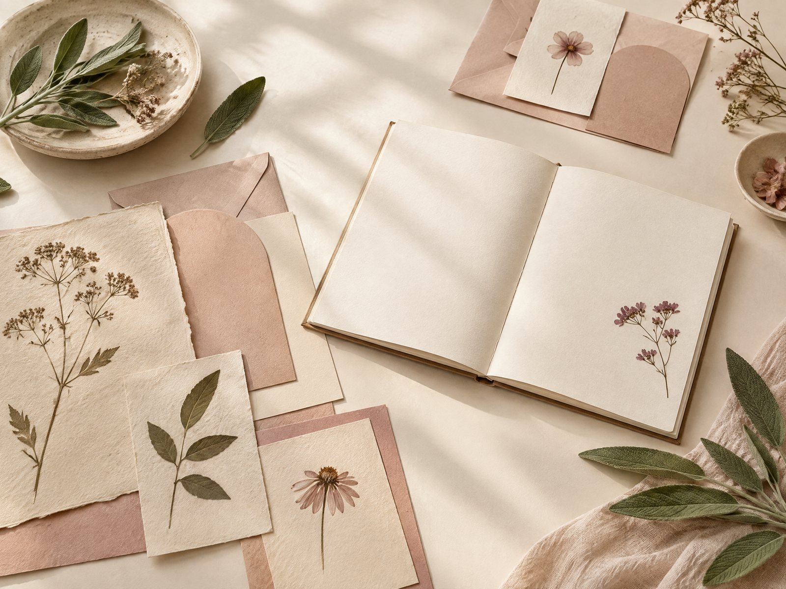

A page can feel unfinished when it needs a visual cue, yet a large sticker can make the writing area awkward. The practical problem is proportion: you want a tiny corner signal for a reading note, idea, or finished task without covering a sentence or competing with the page’s purpose. Farouk Book Store’s editorial selection offers small decorative possibilities, but the useful project is not simply choosing a pretty sticker. It is designing a repeatable corner language that stays quiet when you are writing and becomes noticeable when you are scanning.
For a sense of the shop’s scope before you browse, visit the Farouk Book Store about page. Then return to the page problem: the aim here is a small, deliberate composition, not a claim that every item comes from one matching collection.
Think of each corner as a reserved little frame. A single leaf, window, star, or other compact mark can identify a page type. Two related corners can create a bracket around a title. A deliberately empty corner can be part of the design. The goal is a composition that supports the page rather than asking the page to support the decoration.
Start with the page job, not the motif
Before opening a sticker sheet or browsing a sticker collection, name what the page must do. A reading-response page needs room for quotations or paraphrased observations. A project index needs quick recognition from the edge. A personal idea page may tolerate more visual play, but it still needs a clear place for words. Write the page job in one phrase: “find later,” “develop an idea,” “record a source,” or “capture a question.” That phrase determines how much visual weight the corner can carry.
For a “find later” page, choose one mark and keep it in the same outer corner each time. The mark becomes an index cue, not a decoration scattered across the spread. For “develop an idea,” use a slightly more expressive pair: one motif at the top outer corner and a smaller echo at the bottom outer corner. The open middle remains available for arrows, revisions, and unfinished thoughts.
A frequent failure is starting with four attractive motifs and assigning each one to a random corner. The result looks lively in isolation but is slow to interpret. Fix it by limiting the first trial to one page purpose and one placement rule. If you later add a second purpose, change either the motif family or the corner—not both at once. This makes the visual system learnable.
Leave a margin between the motif and your writing. Do not measure this by an imagined universal number; use the actual page. Place a pencil mark where the longest heading, widest list, or largest handwriting normally reaches. The sticker should sit outside that working zone. If the page is narrow, a motif may belong just inside the top edge rather than at the extreme corner. A clean boundary matters more than a perfectly symmetrical distance.
Build a three-size corner vocabulary
Tiny compositions work best when scale has a job. Prepare three roles: anchor, echo, and pause. The anchor is the most recognizable mark and appears once. The echo is smaller or visually simpler and may repeat. The pause is the blank space that keeps the two from becoming a border.
A real sticker option such as the Ocean Window clear vinyl sticker demonstrates the anchor principle. Its compact 2-by-3-inch format and transparent background can read as a small scene rather than a heavy block when positioned with restraint. On a wide notebook page, try placing one anchor at the top-right corner and leave the rest of the spread untouched. On a narrow page, test it on a separate scrap first; the same visual may feel oversized once handwriting is added.
The pause is not wasted space. It is the gap that keeps a corner from turning into a full-page frame. If you use two marks, let one carry the recognizable shape and make the other a quiet color or line echo. Avoid pairing two equally detailed anchors. They compete, and the eye may land on the corner instead of the heading.
You can also make a vocabulary from a sticker sheet. The Blooming Records Sticker Sheet contains 18 record-inspired and floral designs on a 4-by-6-inch backing. Instead of treating all 18 as a single visual burst, sort them by role: a compact record shape for “media notes,” a floral detail for “creative response,” and a small neutral-looking accent for “source or follow-up.” The point is not to use every design. A sheet becomes more useful when you edit it.
Test the composition before committing
Make a paper mock-up before you place anything permanently. Cut small rectangles from scrap paper that approximate the sticker footprint, or use removable notes as stand-ins. Write three lines in your normal hand on the page: a heading, a long sentence, and a short list. Place the mock-up in the intended corner and read the page at arm’s length. Then slide it closer to the writing and check the tightest point.
Run three tests. First, the scan test: close the notebook, reopen it, and see whether the corner helps you locate the page purpose. Second, the writing test: add a line below the heading and a note near the outer margin. Third, the turn test: flip several pages and check whether the accents catch, overlap, or create a confusing cluster along the edge. A corner motif that works on one open spread may become noisy when six decorated pages sit together.
A common failure is placing the motif before writing. Later, a heading expands into the corner or a diagram needs the exact space that the decoration occupies. The adjustment is simple: draft the page’s largest likely element first, then reserve the corner. For recurring layouts, draw a faint pencil boundary on the first practice page and use it as a placement guide until the habit becomes natural.
Another failure is using a very detailed sticker at a tiny scale. Fine lines disappear visually, while saturated color remains prominent. Choose a bold silhouette for a truly small mark, or give a detailed motif more breathing room. If the motif has text-like detail, keep it away from the page edge where it will be harder to read. The corner should be legible as a shape, not demand inspection.
Photograph the mock-up from above before making a final decision. The image reveals accidental imbalance that is easy to miss while leaning over a notebook. Look for a corner that is darker, denser, or closer to the writing than its partner. Photographing is also useful when you want to repeat a successful arrangement across several pages without relying on memory.
Match a composition to different page purposes
For a reading note, use a single small botanical or scene-like anchor in the outer top corner. Keep the title and page number separate from it. This gives the page an identity without making the corner look like a competing header. If the note continues onto a second page, repeat the same anchor position rather than adding more motifs; continuity is more helpful than escalation.
For an index or contents page, make the corner slightly more graphic. Place two related marks diagonally—one near the top outer corner and one near the bottom outer corner—but leave the central edge clear for page numbers. The eye can use the diagonal as a frame while the index remains easy to scan. If the page already has bold lettering, reduce the motif count to one.
For a project-planning page, use a corner pair with a deliberate difference: a larger anchor on the first page and a small echo on follow-up pages. This creates a beginning-and-continuation signal without labeling every page with extra words. Keep checkboxes and dates in their own area. Decorative marks should not be mistaken for completion symbols.
For a reflection page, a little more asymmetry can work. Put one motif in the top-left corner and leave the bottom-right open for a final sentence or next-step note. A balanced design is not always a centered design. The empty diagonal gives the writing a visual destination and prevents the spread from becoming a boxed-in card.
If you want a motif family that moves beyond paper, the Botanical Bliss Spiral Lined Notebook can be a useful botanical starting point for a coordinated notebook project. Its 7-by-9-inch format and 120 lined pages provide a defined surface for testing repeated corner positions. Treat the notebook and any sticker or paper accent as separate pieces in a shop selection; visual similarity does not make them a manufactured set.
Edit the finished page with a light hand
After the composition has settled, inspect the page under ordinary use rather than only as a photograph. Can you find the page type quickly? Can you write to the outer edge without hesitation? Does the corner still look intentional when the page is half full? If the answer to any question is no, remove an element before adding another.
The best adjustment is often subtraction. Replace two small motifs with one. Move an anchor farther from the text. Keep a repeated mark on only the first page of a section. If a corner looks stranded, add a pencil rule or heading alignment—not necessarily another sticker. Visual structure can come from writing as much as from decoration.
Keep a tiny record of successful choices: page purpose, corner used, motif role, and what you left blank. This turns a one-off craft experiment into a personal layout vocabulary. You can note that a top-right anchor worked for reading notes, while a diagonal pair crowded an index. Such observations are more valuable than a generic “make it cute” rule because they come from your actual handwriting and page size.
A final practical check is ownership of the page’s meaning. Motifs can suggest a mood, but they should not claim that a page is finished, correct, important, or emotionally resolved. Let the written content do that work. Farouk Book Store can be a source for browsing an editorial mix of paper goods and decorative items; your corner system is the part you design through selection, spacing, testing, and restraint.
Related reading: How to Layer Clear Stickers on Journal Pages, How to Choose Stickers for Journals and Planners, and Bookish Stickers for Reading Journals: A Layout Guide.