A small journal can hold a surprisingly vivid trip story when every element has a job. The most useful travel memory sticker layouts do more than fill empty corners: they create a visual route through a page, leave room for a few honest observations, and make tickets, dates, and tiny sketches easy to revisit. Whether you are documenting a weekend in one city or collecting moments from several stops, a compact spread can feel intentional without becoming fussy.
The key is to plan the page around one memory first, then use stickers as signposts. Choose a focal detail—an arrival, a favorite meal, a view, or an unexpected detour—and build the rest of the layout around it. The ideas below are designed for small notebooks, where a little measuring and restraint make a big difference.
Start with a small-journal page plan
Before peeling anything, decide what the spread needs to remember. A two-page layout can record one day, one neighborhood, or one emotional highlight; it does not need to summarize the entire holiday. Write a short working sentence at the top of scrap paper, such as “Rainy afternoon finding bookstores in the old town.” That sentence will help you reject decorations that do not support the story.
The three-zone map
Divide the spread into three loose zones:
- Anchor zone: Reserve the largest clear area for a title, date, mini map, photo, or ticket. On a small page, this might be one 2-by-3-inch rectangle rather than a full-page collage.
- Story zone: Leave space for three to five lines about what happened, what you noticed, or what you would do differently. Handwriting is part of the memory, so do not cover every usable patch.
- Accent zone: Keep one edge or corner for a visual finish: a small sticker cluster, a short strip of tape, or a directional arrow.
For a pocket-sized journal, place the anchor slightly off-center instead of directly in the middle. The asymmetry gives the page movement and leaves a natural writing area beside it. If your notebook opens with a deep gutter, keep important text and delicate sticker edges at least a finger-width away from the fold. A layout that looks balanced while flat can become difficult to read once the pages curve.
Four practical layouts for trip memories
Each layout below works with a different kind of travel evidence. Pick one rather than combining every idea on the same spread.
1. The route-and-stops layout
Use this for a day with several locations. Draw a thin wandering line from the top-left to the bottom-right, then place two or three small stickers along the route. Add a time, place name, or one-word impression at each stop. The line can be handwritten, made with a narrow strip of washi tape, or left implied by the direction of the stickers.
A city-themed sheet is especially useful here. The City Nights Sticker Sheet includes 16 stickers on a 4-by-6-inch sheet, giving you options for urban accents without forcing every stop to look identical. Use one larger motif near the title and two smaller pieces beside the route. If the stickers compete with handwritten place names, move the labels outside the line and use a consistent lettering style.
Troubleshooting: if the route makes the spread feel cramped, remove the line and keep only three numbered stops. If your trip included more than three places, write the extra names in a short list and let the stickers identify the mood rather than every location.
2. The postcard-window layout
This layout treats the page like a miniature postcard. Put a photo, sketch, receipt, or colored paper block on one side and frame it with stickers on two adjacent edges—not all four. Add the destination and date on the open edge so the page does not look sealed shut.
The Cloudy Skies Aesthetic Sticker Sheet is suited to a quiet view, train window, or weather note. Its 12-sticker sheet and soft matte look can support a calm page: place one cloud motif partly over the paper block, then repeat a smaller accent near the date. Leave a visible border around the photo so the eye can distinguish the keepsake from the decoration.
Troubleshooting: if a paper item is curling, do not cover its corners with stickers immediately. First flatten it under a book, or use a small amount of removable tape on the reverse if your journal allows it. If the page feels too pale, add contrast with a dark pen or a short handwritten caption rather than adding many more stickers.
3. The ticket-pocket layout
Use this for transport memories, museum admissions, café cards, or other flat ephemera. Create a visual “pocket” with two short strips of tape along the bottom and one side, leaving the top open. Slide the ticket behind the strips so you can remove it later. Add a small sticker above the pocket and write the route, fare, or feeling beside it.
The Paper Planes and Boats Washi Tape can make a fitting border for journeys by train, ferry, or plane. The roll is 15 mm wide, so tear a narrow piece or cut it lengthwise if a full strip feels too heavy for your page. Because the catalog describes it as removable, test a small piece on your paper before building the pocket; paper surfaces vary, and older pages may lift.
Troubleshooting: if the ticket slides out, shorten the opening or add a third small tape tab at the lower corner. If the ephemera is wider than the page, scan or photograph it and attach a reduced copy, while noting where the original is stored. Avoid placing bulky items near the journal spine, where they can strain the binding.
4. The one-memory constellation
When your journal page is very small, choose one main memory and surround it with five or six “orbit” details: a snack, color, sound, local word, weather note, and a tiny sketch. Put the main sticker or title in the center, then space the details around it with short lines or arrows. This creates a complete story without needing a large collage.
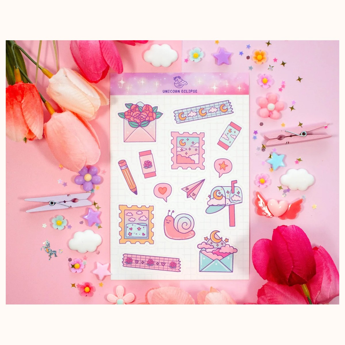
For a handmade-mail, postcard, or correspondence-themed trip page, the Penpal Snail Mail Aesthetic Matte Sticker Sheet can add envelope and letter motifs around a written message. The sheet contains 14 individual stickers on a 4-by-6-inch format. Use just two or three pieces, especially if your page already includes a long paragraph. The matte finish can also help keep the spread visually quiet beside darker handwriting.
Troubleshooting: if the constellation looks scattered, repeat one shape or color at least twice and align the written details along an invisible curve. If it becomes too symmetrical, shift one small accent toward the outer margin. The goal is an easy-to-follow cluster, not a perfect diagram.
Layer stickers without losing the story
Layering works best when each layer has a different scale or purpose. Start with a background strip or larger sticker, add a medium focal piece, and finish with one tiny accent. Three layers are often enough for a small journal page. A fourth layer should solve a specific problem, such as covering a smudge or connecting two separate elements.
Keep a visual hierarchy by varying placement rather than repeating the same size in a row. For example, put a larger city motif near the title, a smaller icon beside the date, and a tiny dot or star next to the final sentence. Leave some sticker backing unused until the end so you can test scale before committing.
When a sticker is larger than expected, trim only if the shape still reads clearly and the product page does not indicate a special border or finish that could be damaged. Otherwise, move it to the outside cover, a pocket, or a supporting page. The stickers collection is a useful place to compare available sheet styles and choose a scale that fits your notebook before you start.
For application, clean and dry the page, fold the sticker backing slightly, and expose only one edge first. Press outward from that edge to reduce wrinkles. If a corner lifts, reinforce the page with a small paper layer rather than repeatedly peeling the sticker, which can roughen the journal surface. Product colors can look different in person because of lighting, photography, printing, and screen settings, so leave room for a small color adjustment when planning a coordinated spread.
Finish, protect, and revise the spread
A finished page should be readable at a glance. Check it in this order: Can you find the destination and date? Can you identify the central memory? Can you read the caption without moving a sticker? If any answer is no, edit before adding more decoration. Removing one accent often improves a page more than adding another.
For pages that will travel in a bag, let adhesive pieces settle before closing the journal and avoid placing wet items inside the spread. Matte sticker paper, vinyl, and washi tape can behave differently on different papers, so test an edge in an inconspicuous area when the journal is precious. Keep unused stickers in a flat sleeve or envelope, labeled by trip or color, so future layouts begin with a manageable selection instead of a crowded pile.
If you are unsure whether a particular item or catalog detail suits your notebook, review the product page and contact Farouk Book Store for verification before ordering. The practical choice is the one that fits your page size, writing habits, and memory—not necessarily the sticker with the most elaborate design.
Related reading: How to Choose Stickers for Journals and Planners · Best Stickers for Scrapbooking: A Creative Guide · Vinyl vs. Paper Stickers: A Complete Guide