A stay-at-home weekend can leave you with plenty of impressions and nothing tangible to keep: the best light on the block, a drink shared on the patio, or the route you take to a familiar market. A postcard-style project gives those small scenes a clear shape without pretending they were an exotic trip. Farouk Book Store is a useful place to begin because its note-card selection can serve as a compact paper surface for sketches, captions, and short observations. The goal is not to reproduce a destination postcard. It is to make a small, honest record of where you already are.
This project works for one person, a household, or a small group of friends. Each finished card can stay in a box, become a temporary display, or be handed to someone who shared the day. You do not need a printer, a camera, or a dramatic itinerary. You need a bounded set of cards, a few ordinary subjects, and decisions that keep the page from turning into an overfilled scrapbook.
Start with a local scene list, not a travel itinerary
Begin by writing down five scenes you could notice within an ordinary afternoon. Keep them specific enough to picture: the shade under a particular tree, the corner table at a café, the view from a bus stop, a grocery-store flower bucket, or the sound of a basketball court after sunset. “My neighborhood” is too broad; “the blue awning beside the laundromat” gives you something to draw or describe.
Choose three scenes for the first batch. Three is enough to create a set and small enough to finish. A useful sequence might be:
1. A beginning: the place where the day starts, such as a front step or kitchen window. 2. A middle: a stop that adds texture, like a shaded bench or a busy corner. 3. An ending: a quiet detail that signals the day is over, such as a porch light or the last cup on a table.
This is a paper project about observation, not a ranking of local attractions. Avoid language that implies a place must be impressive to deserve a card. A cracked sidewalk with chalk marks may carry more personal meaning than a famous landmark. If you are working with another person, let each participant choose one scene rather than agreeing on a single “best” location. Different choices are what make the set feel lived-in.
Before choosing materials, decide whether the cards are private notes, gifts, or a shared display. A private card can include an exact address or an inside reference. A card intended for someone else should use only details you are comfortable sharing. If a person appears in a sketch or photo, ask before including their recognizable likeness. A street sign, house number, license plate, or child’s name may be unnecessary to the story; leave it out.
Choose a card format that supports the idea
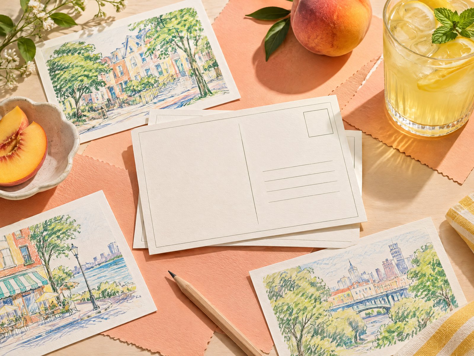
A postcard-style card does not have to meet postal dimensions or follow postal rules. Here, “postcard-style” means a front with an image or visual cue and a back with a short message, date, and optional recipient. That distinction keeps the project focused on local storytelling rather than postal regulations or promises about mailing.
For a sturdy, repeatable base, look at the Note Cards collection and compare the visual mood of several options. The cards are part of Farouk Book Store’s editorial selection; Farouk is presenting a range of catalog goods, not claiming to manufacture every design. Choose one design for a coherent set, or deliberately assign different designs to different scenes.
Three practical starting points are:
- Starry Clouds Note Cards, which can frame an evening scene, a moonlit walk, or a quiet end-of-day observation.
- Study Night Note Cards, a natural fit for a library stop, a desk viewed through a window, or a late café visit where the mood is concentrated rather than festive.
- Pastel Academia Note Cards, which can support a bookshop window, an old building detail, or a slow afternoon built around reading and writing.
These are not rules about what a design “means.” They are prompts for matching atmosphere. If the actual scene conflicts with the decorative mood, keep the scene. A bright afternoon can belong on a starry design if that contrast is intentional. Before ordering, review the individual listing and confirm current availability and details. The website bag prepares an email order request, so inventory, taxes, and shipping still need confirmation rather than assumption.
If you prefer a more neutral result, use the least busy side as the writing side and keep the visual treatment spare. If every card has a large illustration, the set may feel like three unrelated products instead of one project. One repeated mark—a small border, a single color of pencil, or the same date placement—can unify different designs without covering them.
Build each card in two passes
The easiest way to avoid a crowded card is to separate noticing from decorating. In the first pass, make the information work. On the front, add one visual anchor: a simple sketch, a block of color, a tiny map-like line, or three words that identify the scene. On the back, write four items:
- the date or time of day;
- the local place in a broad, privacy-conscious way;
- one sensory or visual detail;
- one sentence about why you noticed it.
For example, a front might show three uneven rectangles for apartment windows with one lit square. The back could say: “Saturday, after dusk. The row of windows across from the park. One light came on while the sky was still lavender. I liked how the whole block changed in one minute.” That is enough. It does not need a full itinerary or a review of the neighborhood.
Use a short caption test before committing: can you read it aloud in one breath? If not, remove the setup and keep the detail. “We decided to go out after lunch and then…” is background. “The ice melted before we reached the next corner” is a scene. A concise line also leaves room for a small arrow, date stamp, or hand-drawn divider.
Try a limited visual vocabulary across the set. You might use one line for a horizon, two dots for people seen at a distance, and a rectangle for architecture. Or choose one accent color for drinks, flowers, or signage. Do not add a sticker to every empty area. Empty space can separate the main image from the caption and helps the three cards read as a sequence.
A common failure is drawing what you think a postcard should show: a perfect skyline, a centered landmark, or a scenic view with no personal clue. Correct it by adding one ordinary interruption. Include the delivery bike that passed, the crooked patio chair, the receipt tucked under a cup, or the shadow from a nearby fence. The small interruption is often the evidence that the card belongs to your day rather than a generic travel brochure.
Another failure is writing only adjectives: “beautiful,” “fun,” or “relaxing.” Replace one adjective with an observable fact. Instead of “a beautiful park,” write “three scooters were lined up beside the drinking fountain.” This keeps the project grounded and avoids claiming that a scene affected everyone in the same way.
Sequence, share, and revise the finished set
Lay the three cards side by side before deciding they are complete. Look for repetition in both subject and sentence length. If every card shows a building, change one front to a detail from the ground: a painted curb, a plant in a doorway, or a pattern of paving stones. If every caption begins with “I saw,” vary the structure with “At noon,” “Near the corner,” or “The detail I kept noticing was…”
Then choose one of three endings for the set. For a personal record, put the cards in an envelope with the date range and leave the backs visible. For a shared display, arrange them from morning to evening and add a small title card that names only the broad area. For a gift, write a short note explaining the project and leave the recipient room to add a fourth local scene. Avoid turning the recipient into an audience who must respond; the card can be an invitation, not an assignment.
If you want to mail a finished card, check the current requirements with the relevant postal service and select an envelope if the paper or decoration calls for protection. This guide is about the creative format, not postal compliance. Keeping that boundary clear prevents a charming paper experiment from becoming an accidental promise about delivery.
Review the practical details before requesting products through Farouk’s site. The catalog selection may change, and the email order request is not a payment checkout. If you need clarification about a listing or an order request, use Farouk Book Store’s contact page. You can also learn more about the shop and its stated information on the About page. Those links are useful when your project depends on selecting a particular paper item rather than an imaginary postcard format.
The strongest staycation set is not the one with the most decoration. It is the one that makes three familiar scenes distinct: a place, a detail, and the reason you paused. Farouk’s note-card edit can provide the paper starting point, but your choices supply the meaning. Keep the scale small, protect other people’s privacy, and let the ordinary view do the work.
Related reading: Why Handwritten Greeting Cards Still Matter, How to Build a Personalized Gift Bundle, and Small Gifts for Book Club Members Without Matching Everyone.