You have a new occasion, a blank card, and one visual theme you already know you love. The difficulty is not finding something attractive; it is deciding whether repeating that motif will feel thoughtful or merely convenient. Farouk Book Store’s catalog makes that choice easier when you treat a motif as part of an editorial selection, not as a rule that every item in a gesture must match. The useful question is: what does this familiar image contribute to this particular moment?
A returning motif can signal continuity, recognize a shared preference, or give a small paper gift a clear point of view. It can also flatten a series of occasions if the same image appears without a new reason. The following method helps you reuse a favorite with intention, notice when it has done its work, and switch styles without making the change feel abrupt.
Start with the occasion, not the image
Before opening a product page, write the occasion in one plain sentence: “I am marking a new job,” “I am sending a thank-you after a visit,” or “I am making a small birthday gesture.” Then add what you know about the recipient’s connection to the motif. Do they have an established preference for botanical illustrations? Did they once point out a particular flower? Is the image simply your own favorite, with no evidence that it means anything to them?
This distinction separates a meaningful return from a reflex. A familiar motif is a strong choice when it does at least one of three jobs:
- It recalls a shared detail without requiring a long explanation.
- It creates a recognizable thread between two separate gestures.
- It gives a neutral occasion a visual character that suits the recipient.
It is weaker when it is being used because the decision feels difficult, the recipient’s taste is unknown, or the old design is the only item you happened to see first. In those cases, pause before adding more of the same. A new style may communicate more care precisely because you considered the context instead of defaulting to habit.
A useful test is to remove the motif from the sentence. If “I chose this because it suits the new occasion” still makes sense, you have a reason to reuse it. If the explanation becomes “because I used it last time,” the motif may be carrying the entire decision.
Decide whether the second use has a new role
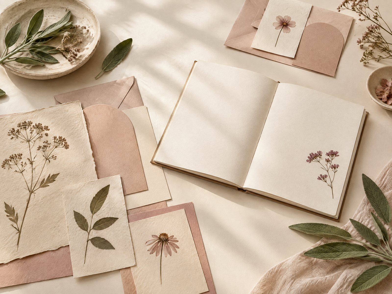
Repetition feels deliberate when the motif changes role. The same botanical character can be a quiet visual signature on a private note, a small accent on a bookmark, or a framing detail around a larger message. What matters is not simply using the same picture twice; it is giving the second use a different job.
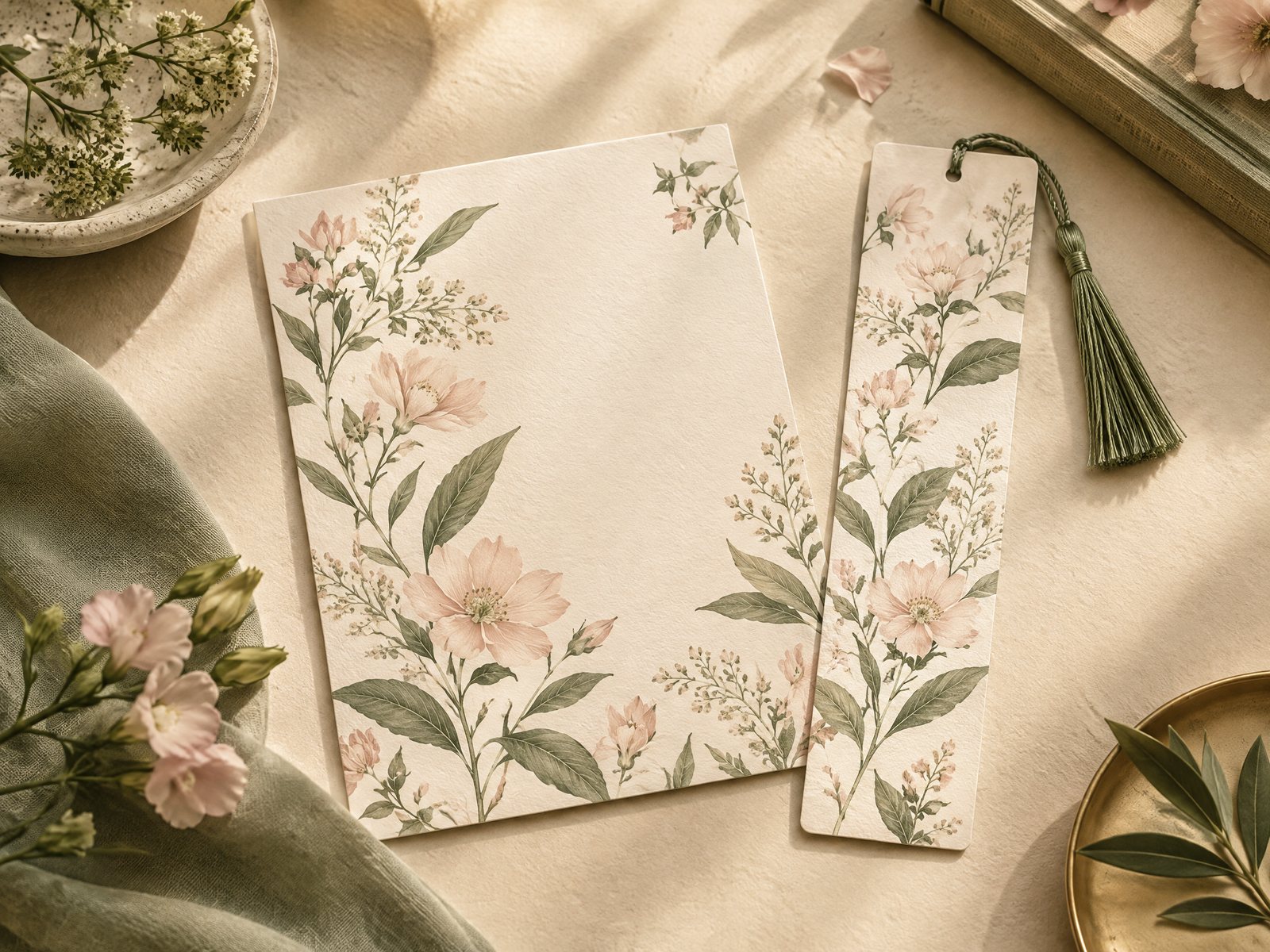
For example, imagine a recipient who enjoyed a botanical-themed note after moving into a new home. For a later reading-related gesture, you could return to that visual language in a smaller, more restrained way. A Botanical Bliss Envelopes stationery set can hold a separate note without making the envelope the entire gift. The catalog description identifies these as A7 envelopes, approximately 5.25 by 7.25 inches, in a set of 10, with full-color printing on the outside and inside. Those concrete details make them useful for a coordinated paper moment, while the written message supplies the occasion-specific meaning.
A second route is to shift from a single repeated illustration to a related family of images. Blooming Records Sticker Sheet contains 18 record-inspired and floral designs on a 4 by 6 inch matte sticker sheet. That is not the same visual statement as repeating one flower. It lets you keep a floral direction while introducing music-related shapes, a different scale, and more choice. Use one small sticker as an envelope accent or on an outer card sleeve rather than scattering every design across the project.
For a quieter return, a Botanical Bliss Spiral Lined Notebook can make the motif part of an everyday object rather than another decorative flourish. The product is listed as a 7 by 9 inch spiral lined notebook. If the occasion is a new study routine or a personal writing gift, the notebook’s practical role differentiates it from an earlier note or sticker accent. Farouk is presenting these catalog choices as a shop’s editorial selection; it is not a claim that Farouk manufactured every design or owns the original artwork.
Before choosing, name the new role in six words or fewer: “quiet envelope for a private note,” “floral accent on a reading gift,” or “useful notebook for a new project.” If you cannot name a new role, you may be repeating the image rather than developing the gesture.
Choose return, variation, or a clean break
Use a three-way decision instead of forcing yourself into “same” or “different.”
Return unchanged when the continuity is the point. This works for a recurring exchange, a series of notes, or an occasion where the recipient has explicitly enjoyed the motif. Keep the rest of the composition simple so the familiar image reads as a deliberate signature. One envelope, one card, and one clear sentence can be more convincing than a full matching set.
Vary the motif when the relationship is familiar but the occasion is not. Keep one connecting feature—botanical subject, warm color family, or small scale—and change everything else. A sheet with mixed floral and record imagery, for instance, can bridge a previous plant-centered choice and a new music-related context. Variation is especially useful when you want recognition without implying that every event should look identical.
Make a clean break when the old motif has become the message. If the recipient has received several gifts with the same visual language, another repetition may make the gesture feel preassembled. Choose a new style when the occasion itself calls for a different mood, when the recipient’s interests have clearly changed, or when you have no personal evidence that the old motif matters to them. A clean break does not reject the earlier choice; it gives it room to remain associated with its original moment.
Try the “three clues” check before finalizing. List one clue from the occasion, one from the recipient, and one from the object’s practical role. If two or three clues point toward the same motif, reuse is defensible. If only the object clue points there—“I already have this design”—look for another style. This small pause prevents convenience from disguising itself as consistency.
Build the new gesture without overmatching
Once you decide to return, establish a limit. Choose one anchor item, one supporting paper element, and one place for the written message. The anchor may be the envelope, a notebook, or a small sticker accent. The supporting element should clarify the occasion, not compete with it. Leaving some surfaces plain is part of the design decision.
Consider three practical arrangements:
The familiar anchor. Use the botanical envelope as the only patterned element. Add a plain card inside and write a message that refers to the new occasion. This is the safest option when the recipient likes the motif but you do not know whether they want a highly decorated gift.
The related variation. Use one floral sticker from the Blooming Records sheet on an otherwise plain outer sleeve, then introduce the record connection in the message or accompanying playlist conversation. Do not use all 18 designs simply because they are available. A single mark can show continuity while preserving visual hierarchy.
The useful return. Pair a motif-led notebook with a short note explaining why the format fits the recipient’s next activity. Keep the note specific—“for the ideas you mentioned collecting”—rather than making broad claims about how stationery will change their habits. The object should remain an invitation, not an obligation.
Watch for scale conflicts. A large patterned envelope beside a heavily decorated card can make the motif feel loud, while a tiny sticker on a busy notebook may disappear. If both items are visually strong, remove one supporting element. If both are quiet, add a single contrasting mark rather than a second full pattern.
Also check the practical facts before you promise a particular arrangement. Product images and colors can look different because of photography, lighting, printing, or screen settings, and listed dimensions are approximate where the catalog says so. Farouk’s website bag prepares an email order request rather than a payment checkout, so inventory, taxes, and shipping should be confirmed before you describe the finished gesture as ready to send. If you need a clarification about a listed item or your intended combination, use Farouk’s contact page; for context about the shop, see About Farouk Book Store.
The final decision should survive a one-day pause. Set the selected items beside a plain alternative and ask which version makes the occasion clearer. If the repeated motif still feels right without additional decoration, keep it. If the plain alternative suddenly gives the message more room, switch styles. The goal is not novelty for its own sake or perfect matching. It is a paper gesture in which the visual choice has a reason, the object has a role, and the recipient can encounter the motif without being asked to decode it.
For a broader visual starting point, browse the Farouk Book Store stickers collection.
Related reading: How to Organize a Sticker Collection Without Wasting Space, How to Choose Stickers for Journals and Planners, and Best Stickers for Scrapbooking: A Creative Guide.