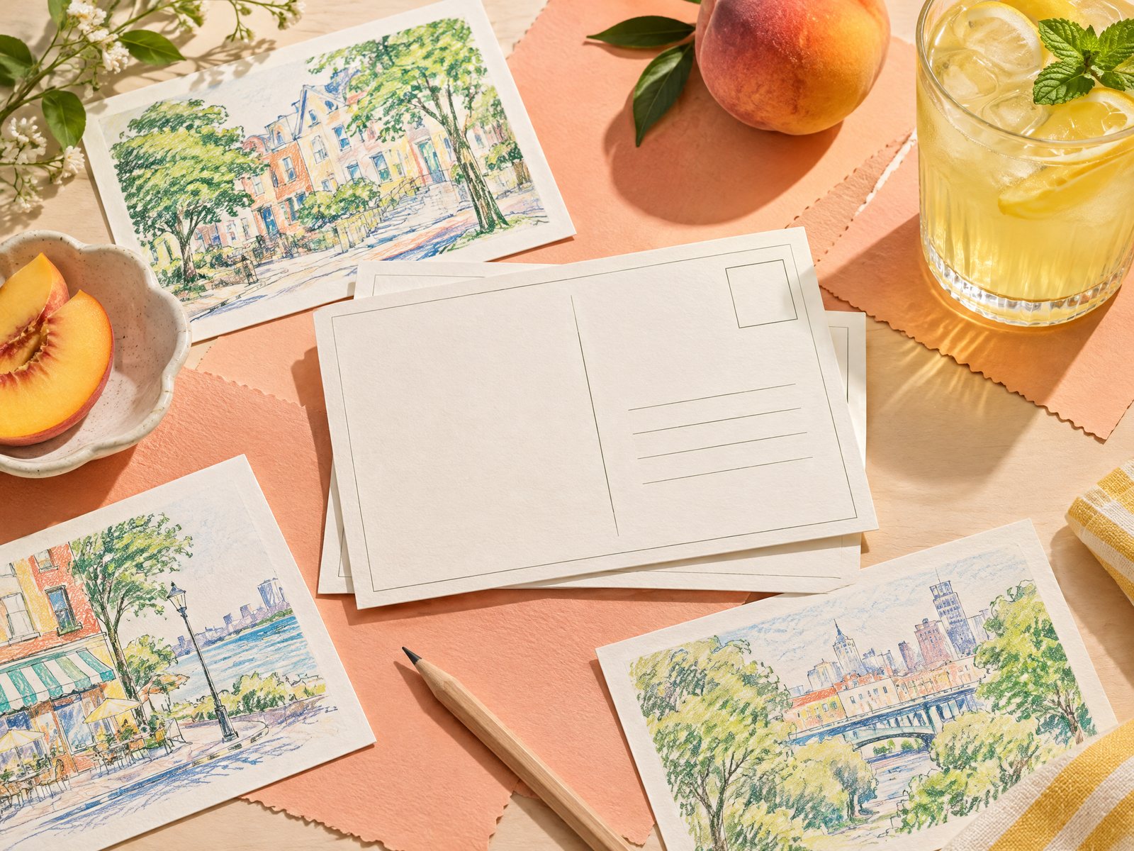

A customer asks, “What is this made of?” or “Would this work for quick notes?” and the answer cannot depend on whoever happens to be standing nearby. Retail staff need a fast, factual way to explain a product while being honest about what the catalog confirms and what still needs checking. For Farouk Book Store, a product story card is an internal aid: a small reference that turns verified listing details into a useful conversation, without presenting Farouk as the manufacturer of every design in its selection.
The best card is not a miniature advertisement. It is a controlled summary of evidence: product name, SKU or catalog identifier, category, confirmed format, stated materials or finish, practical uses supported by the listing, and a short “check before promising” note. That structure helps a new team member answer confidently, gives an experienced seller a quick reset, and protects the customer from polished but invented details.
Start with a fact boundary, not a sales script
Before writing a sentence, divide information into three columns: verified, useful interpretation, and unknown. Verified facts can be copied or carefully paraphrased from the current product record. Useful interpretation explains why a confirmed feature may matter in a retail conversation. Unknown information stays unknown; it does not become a confident adjective.
For example, the catalog entry for Pastel Academia Note Cards states a bundle of 50 cards, a 3-by-5-inch format, 14 pt matte paper, one ruled side, and a blank reverse. A card can translate those facts into: “A compact two-purpose format for lists on one side and sketches or extra notes on the other.” It should not add “archival,” “professional-grade,” or “ideal for every pen” unless those claims are actually documented.
This distinction is especially important when a design looks familiar. Farouk is a shop with an editorial selection, not an asserted manufacturer of all catalog designs. Avoid sentences such as “we developed this paper,” “our artists created this motif,” or “our production team tested it.” A safer phrasing is “The listing describes this item as…” followed by the precise detail. That wording is not timid; it tells staff and customers where the information comes from.
Put the source date or review date at the bottom of each card. Catalog information can change, and a card that was accurate last season may not reflect a revised listing. If the product record does not state a material, do not fill the blank with a guess based on appearance. Write “material not specified in current listing” and route the question for confirmation.
A useful card template has these fields:
- Product title and SKU, handle, or other internal identifier
- Category and the one-sentence customer problem it may help with
- Confirmed format, quantity, size, finish, and material wording
- Two practical uses supported by the listing
- One limitation, uncertainty, or care point that staff should not skip
- Date checked and initials of the person who reviewed it
This format keeps a story card factual while still giving staff a human way into the conversation.
Turn catalog details into a short product story
A product story is not a biography of an item. It is a three-step explanation: what it is, what its confirmed features enable, and who might find that useful. Keep the first sentence descriptive, the second practical, and the third conditional rather than absolute.
Consider Reading Room Note Cards. The listing confirms 50 cards measuring 3 by 5 inches, 14 pt matte paper, a lined face, a blank reverse, and a portable format. A staff card might read:
> “This is a 50-card, 3-by-5-inch note-card set on 14 pt matte stock. One side is lined for lists or notes, while the reverse is blank for a sketch, label, or free-form idea. It may suit someone who wants a small, two-sided card for carrying in a notebook or card holder; confirm the customer’s preferred writing tool if that matters.”
Notice what this does not say. It does not promise that every ink behaves identically, claim a universal no-bleed result, or imply that the customer needs a particular lifestyle. It gives a reason to pick up the product and a sensible follow-up question.
For a different kind of use, Blooming Records Sticky Notes has a decorative design, a 3-by-3-inch square format, 50 sheets, and adhesive backing. Its story is about temporary prompts, labels, bookmarks, or short reminders—not about writing a long message. The staff version can say: “The compact adhesive format is suited to a brief visible reminder or a small marker inside a book. If the customer wants a permanent record, show a non-adhesive card or pad instead.” The contrast helps staff recommend by task rather than by visual appeal alone.
A third example is the Laundromat Daily Planner Pad. Its listing describes 50 non-adhesive sheets, an 8.5-by-5.5-inch format, and a tear-off pad suited to quick lists, shift notes, or requests. That supports a story about leaving a short paper record or keeping a working list near a task. It does not support claims about a particular workplace, industry standard, or guaranteed durability. The unusual design may be part of its appeal, but the card should lead with format and use before making the theme the entire pitch.
Use verbs such as “supports,” “gives,” “fits,” and “may suit.” Avoid “solves,” “guarantees,” and “perfect for.” This small language adjustment keeps the staff member helpful without turning a possibility into a promise.
Design cards for decisions at the counter
A story card should answer the questions that actually slow down a purchase. Put the most decision-relevant facts near the top: size, quantity, adhesive or non-adhesive format, lined or blank surfaces, and any explicitly stated finish. A customer choosing between a sticky note and a note card should not have to search through decorative copy to learn whether the paper can be removed or retained.
Use a two-sided card when the product has enough nuance. The front can hold the quick story and three verified bullets. The reverse can hold “Ask before recommending” prompts:
- Is the customer writing a one-time reminder or keeping a record?
- Do they need a portable size or a larger writing area?
- Do they want adhesive backing, or should the paper lift away as a separate sheet?
- Is the visual theme important, or is the format the priority?
- Does the customer need a detail that the current listing does not confirm?
These questions are not a script to force on every shopper. They are a reset when the request is vague. “I need something for work” could mean a pocket reminder, a desk pad, a thank-you note, or a card for passing along information. Ask one clarifying question, then show one or two options rather than narrating the whole catalog.
A simple color code can make internal use faster: black for confirmed product facts, blue for suggested customer questions, and a clearly marked box for “not stated.” Avoid decorative claims that visually overpower the evidence. If cards are kept at a counter, use large enough type that staff can glance down without losing the conversation. If they are stored digitally, keep one canonical version and archive superseded copies instead of letting several conflicting PDFs circulate.
The note card collection can be used as a starting point for grouping related examples, but the story card itself should always point back to the current individual listing or internal record. A collection is useful for browsing; it is not a substitute for product-level verification.
Test the workflow, then revise the weak spots
Run a small pilot with three products from different formats. Give each staff member the cards and ask them to answer the same four customer questions: “What is it?”, “How much is included?”, “What can I use it for?”, and “What do you know for sure?” Listen for where people improvise. If two staff members describe the same item differently, the card needs clearer wording or a missing field.
A common failure is confusing appearance with material. A matte-looking surface may invite a guess about paper stock; a card with a glossy illustration may be assumed waterproof. Remove those assumptions unless the listing confirms them. Another failure is copying a promotional phrase that implies testing, origin, or ownership. Replace it with the catalog’s neutral description and an explicit unknown.
A third failure is allowing a product’s theme to replace its decision facts. A cute design can open a conversation, but a customer still needs to know whether the item is adhesive, how many pieces are included, and whether the format fits the intended task. If a card begins with three lines of mood language and ends with one tiny size detail, reverse the order.
Review cards whenever a title, description, quantity, dimensions, or category changes. Staff should never use a story card to promise inventory, taxes, shipping, or an exact order outcome; those details require confirmation through the store’s current process. When a customer asks for a fact that is absent, the strongest answer is: “I do not want to guess. Let me check the current information.” That sentence builds more trust than an invented certainty.
Finally, make the card accountable. Add a review date, a link or internal reference, and a space for a correction note. A useful card is not the one with the most adjectives. It is the one that lets a retailer explain a real product clearly, acknowledge its limits, and help a customer make a decision without pressure.
If you need help selecting a format or checking a current item, contact Farouk Book Store.
Related reading: Stationery Retail Display Ideas for Compact Shelves, How to Plan a Wholesale Stationery Assortment for a Small Shop, and Stationery Gifts for Coworkers with Different Work Styles.