A pastel paper project can go from airy to visually noisy in a few inches. The usual problem is not that lavender, peach, and sage clash; it is that every pattern is asked to be the main event. Farouk Book Store makes it easier to approach the choice as an edit: select a few paper goods, decide which motif leads, and leave enough unprinted space for the eye to rest. The small mood-board method below is for a journal cover, gift wrap corner, card front, or desk display—not a rule that every pastel item must match.
The useful question is, “What should I notice first?” If the answer changes every time you look at the arrangement, reduce the number of patterns or change their sizes. A successful mix can be cheerful and varied while still giving the viewer a clear path through the page.
Start with a three-part pastel brief
Before choosing tape, make a tiny brief in three lines: lead motif, supporting motif, and breathing space. The lead motif is the pattern with the strongest visual presence. It might have the largest shapes, the clearest contrast, or the only reflective detail. The supporting motif should echo one color or idea without competing for the same job. Breathing space is the plain paper or unmarked area that prevents the composition from becoming a wallpaper of decoration.
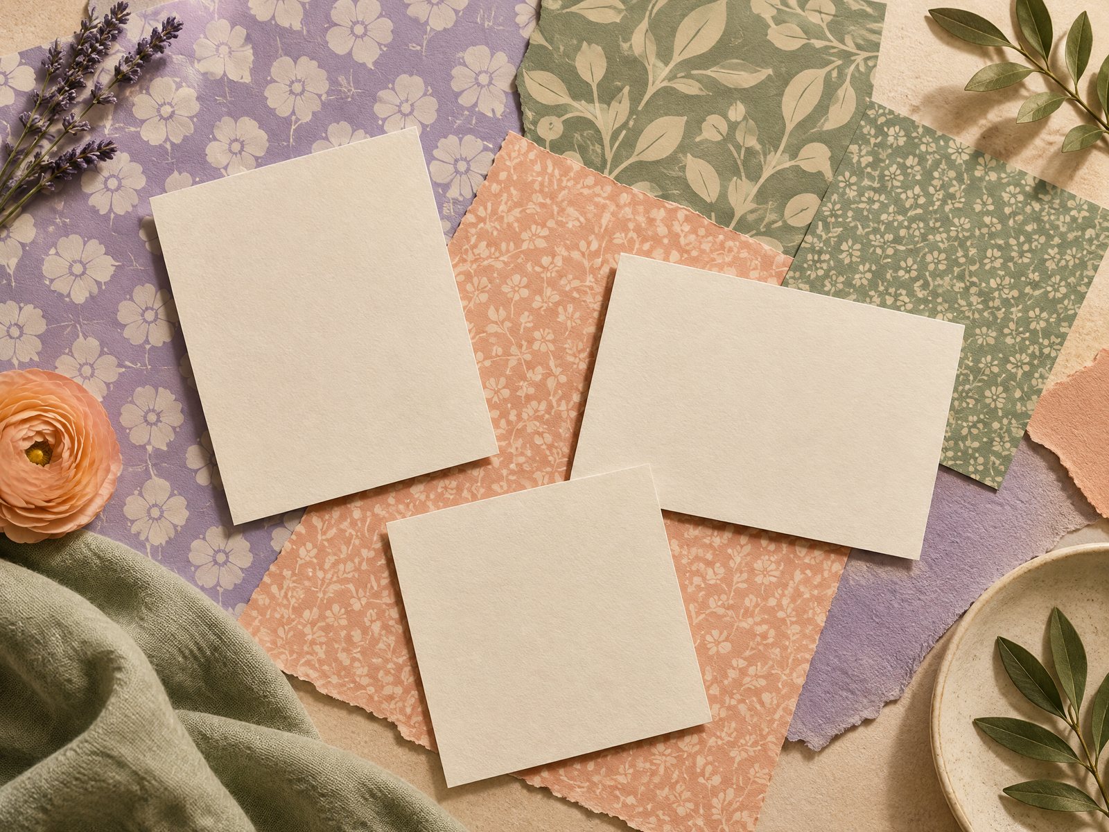
For a first test, limit the palette to three soft colors. Lavender can lead, peach can warm the middle, and sage can provide a quiet counterpoint. This is a working palette, not a claim about what every product contains; check the product photography and description when making a final selection because screen color and printed color can vary. A cream card or unprinted notebook page can count as a fourth, neutral element without adding another motif.
Then choose a subject relationship. Three unrelated patterns can still work, but a loose connection helps: small café marks beside a soft geometric field, tiny stars beside a plain gradient, or scholarly shapes beside a solid color. Avoid choosing three patterns that all have equally dense, equally small marks. That is the combination most likely to read as static at a glance.
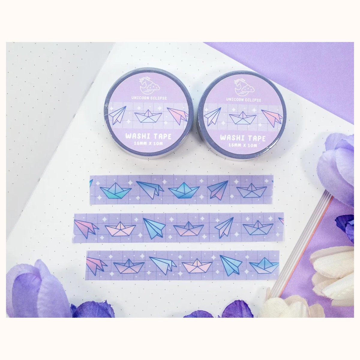
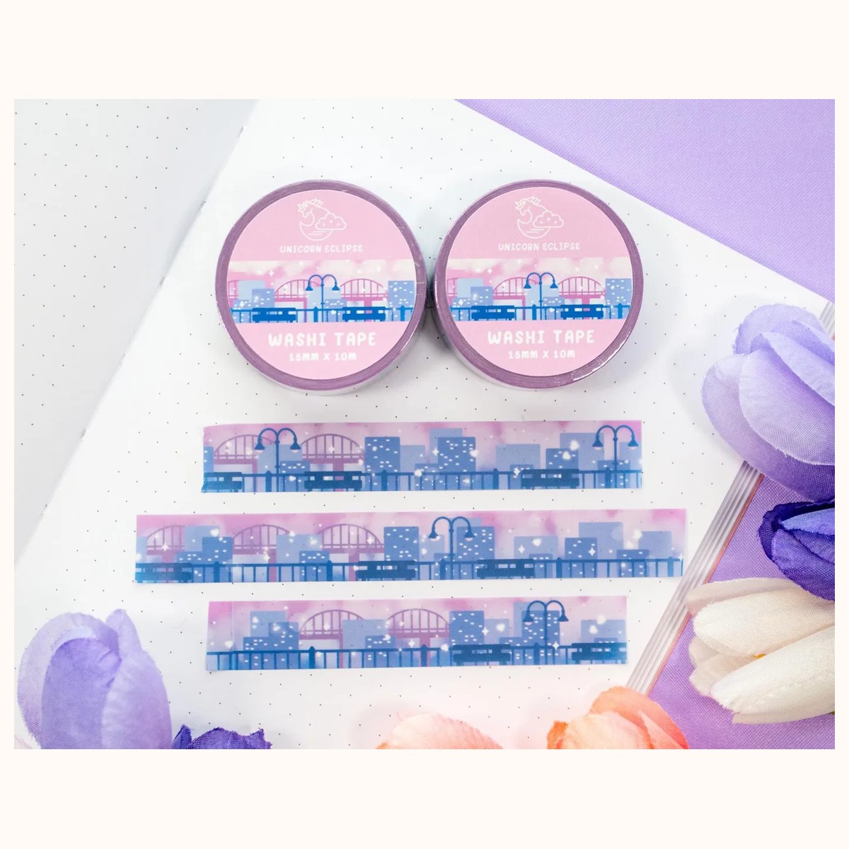
Farouk’s washi tape collection is a practical place to browse this kind of paper accent. Treat the catalog as a shop selection: the aim is to assemble a pleasing combination from available pieces, not to imply that Farouk designed or manufactured every original motif.
Use pattern scale to create hierarchy
Pattern scale is the fastest way to make a pastel mix legible. Imagine three sizes on your mood board:
- Large: one broad field or recognizable cluster that establishes the direction.
- Medium: a repeat that bridges the large pattern and the small details.
- Small: a narrow strip or sparse mark used as punctuation.
Do not confuse the physical width of a roll with the visual scale of its artwork. A narrow tape can have a busy, high-frequency print; a similarly sized strip can feel calm if its shapes are spaced widely. Lay a short piece of each option on scrap paper before committing. View it from arm’s length, then cover one strip at a time. If removing a “supporting” strip makes the whole arrangement clearer, that strip was probably doing too much.
A useful sequence is 60–30–10. Let roughly 60 percent of the visible decorated area belong to the lead tone or pattern, 30 percent to the supporting pattern, and 10 percent to a small accent. These are proportions for judging emphasis, not measurements you need to calculate. On a small card, the accent might be a single three-inch dash. On a journal spread, it might be two short tabs at the edge.
For a soft lead with a bit of shine, Pink Galaxy Silver Foil Washi Tape can serve as an accent rather than the entire background. The supplied catalog describes a 15 mm wide, 10 m long roll with silver-foil details. Because reflective marks attract attention, use a short segment and give it plain space nearby. If you cover a whole border with foil, the shine stops being a punctuation mark and becomes the dominant texture.
Build the small paper mood board
You need only a scrap sheet, three short tape samples, a pencil, and the surface you eventually plan to decorate. Label the samples A, B, and C rather than relying on memory. First, place them in a row with a two-finger gap between each. This isolates their colors and reveals whether one looks much darker, brighter, or busier than expected.
Next, test three layouts:
1. Band: run one longer strip near the bottom, then place a shorter strip above it. Leave the top half blank. 2. Corner: make an L shape with the lead pattern and add the small accent only at the turn. 3. Scatter: use three separate pieces, keeping one color or motif from appearing in every cluster.
The band is dependable for a card or a page header because it gives the eye a direction. The corner works well when you want writing or an image to remain central. Scatter can feel playful, but it needs more restraint: keep the pieces aligned to an invisible edge or repeat one gap so the randomness looks chosen.
Try the samples at their intended size. A pattern that looks delicate as a one-inch swatch may become overwhelming as a full border. Conversely, a busy design may calm down when torn into irregular, short pieces. Tearing can soften a hard edge, while a straight cut gives a more graphic look. Choose one edge treatment for the whole mood board unless the difference is part of the focal point.
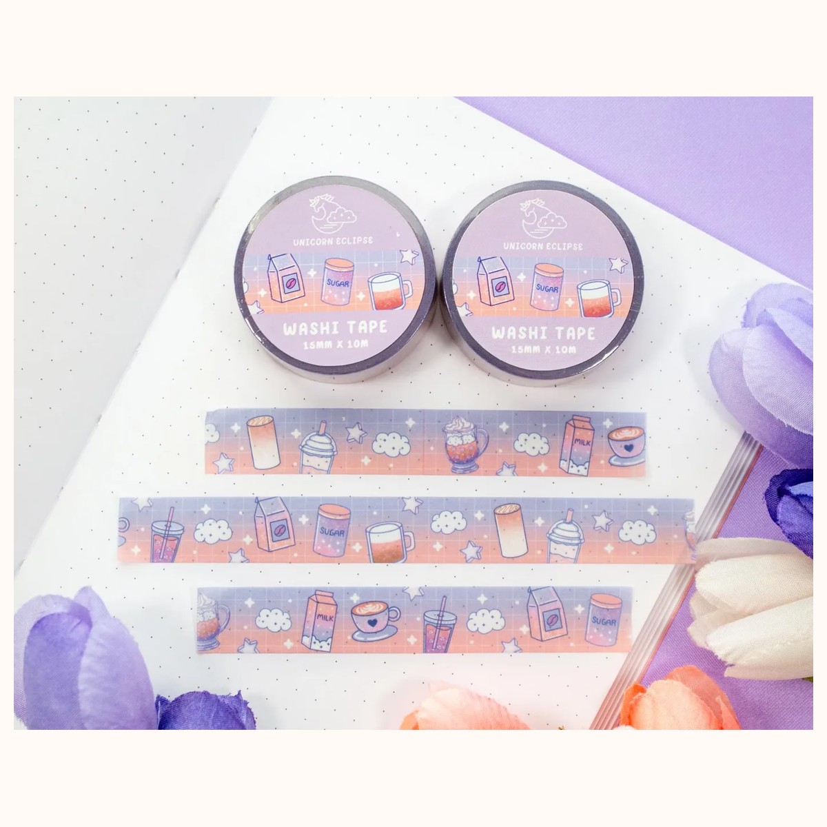
The Coffee Shop Kawaii Aesthetic Washi Tape is one supplied catalog example described in soft, pastel tones and sized at 15 mm by 10 m. Its recognizable café-inspired artwork could be the medium pattern in a cozy paper edit. Use it beside a quieter strip, not beside two other detailed illustrations. A short café segment near a blank cream card gives the motif room to read without turning the project into a theme collage.
Adjust the mix when it fails
A failed mix usually gives a useful diagnosis. If the page feels crowded, do not immediately remove the most colorful pattern. First remove one supporting strip and look again. Crowding often comes from repeated visual weight, not from the number of colors alone. If the page feels flat, add contrast in scale or spacing before adding a new hue. One larger shape and one generous blank area can do more than a fourth tape.
If the colors look washed out together, establish a value anchor: a cream or white field, one slightly deeper pastel, or a dark handwritten title kept in a small area. Do not add black decoration everywhere simply to create contrast. The anchor should guide the eye, not overpower the gentle palette.
If the motifs seem unrelated, repeat one quality rather than forcing a literal theme. Match rounded shapes with rounded shapes, open spacing with open spacing, or matte-looking marks with other quiet marks. A visual echo is enough. Three objects do not need to depict the same subject.
If the design works on scrap paper but not on the final item, check the scale of the surface. A wide journal cover can absorb a longer strip; a small note card may need only a corner. For a coordinated paper gesture, the Pastel Academia Note Cards are described in the catalog as 3 in x 5 in index cards, with 50 cards in a bundle and a ruled front with a blank reverse. That format offers a clear test surface: keep the decorated portion to one corner or a slim header so there is still room for a message or sketch.
A final adjustment is to change the order of operations. Many people decorate first and then try to find a use for the result. Instead, decide whether the piece is a label, border, divider, envelope accent, or card front. The function tells you where the blank area must stay. A label needs readable space; a border needs consistent spacing; an envelope accent can tolerate a more irregular cluster.
Once the mood board passes the arm’s-length test, reproduce only the strongest arrangement. Keep the sample sheet beside you, but do not feel obligated to use every chosen tape. Two motifs may be the finished answer. A third can remain an optional accent for a matching envelope or second page. Restraint is especially useful when the recipient, notebook cover, or surrounding desk already has its own visual information.
Photograph or note the successful order before dismantling the test. Record the lead pattern, the approximate strip lengths, and where the blank space sits. This turns a pleasing accident into a repeatable little system. If you are preparing several cards, vary the placement rather than adding more motifs: move the corner from left to right, reverse the band order, or change the amount of cream space.
Farouk’s selection can support that kind of considered browsing, whether you are choosing one roll or comparing a few paper accents. For questions about a particular listing or an order request, use the contact page; for general context about the shop, see about Farouk Book Store. Product availability, order details, taxes, and shipping should be confirmed rather than assumed from a mood-board plan.
Pastel mixing succeeds when every element has a job. Give one pattern the first word, let another answer quietly, and allow the paper to finish the sentence. The result will feel less like a pile of coordinated supplies and more like a small, readable composition.
Related reading: How to Make Washi Tape Page Borders That Stay Neat, Washi Tape for Beginners: Practical Ways to Start, and Washi Tape Gift Wrapping for Thoughtful Small Gifts.