A favorite motif can look appealing on a product page and still become awkward when repeated across every object you own. The practical problem is not finding three things with the same picture; it is giving one visual idea three different jobs. Farouk Book Store’s catalog can be approached as an editorial selection: choose a related cue for paper, carry, and desk use, then let the function of each surface decide the scale, placement, and amount of decoration.
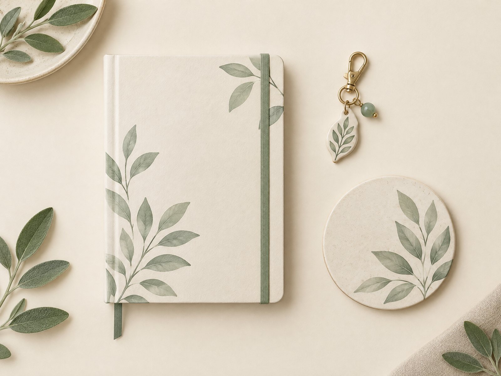
Think of the capsule as a small visual system rather than a matching set. The paper item holds information, the carry item travels, and the desk object occupies a working zone. A sage leaf, for example, may appear as a small page accent, a modest charm, and a quiet coaster-like focal point in a conceptual plan. The items do not need to come from one design family or share identical colors. They only need to converse.
Start with the three jobs, not the picture
Before browsing, write one sentence for each surface. “I need paper for quick notes,” “I need a carry detail I can identify at a glance,” and “I need a desk object that can sit beside my keyboard” are more useful starting points than “I want everything botanical.” This prevents a decorative choice from overruling daily use.
The paper surface should earn its space. A notebook, note pad, card, or sticker placement has to leave room for writing and reading. If the motif is large, reserve it for a cover or a single divider-like moment; if it is tiny, use it to mark a corner or a section. The carry surface needs to survive movement and remain easy to recognize. A charm, keyring, sleeve detail, or bag accent should not create a snag or make an already busy bag harder to use. The desk surface should support a boundary: a coaster, small tray, or other object can establish a visual landing place without occupying the entire workspace.
This division also makes substitutions easier. If the exact motif is unavailable in a useful carry format, keep the color family or silhouette and change the object. Continuity is allowed to be approximate. A capsule fails when the buyer accepts an inconvenient item simply because its artwork matches.
Build a motif vocabulary with one anchor
Choose one anchor characteristic and let the other two be supporting references. The anchor might be a leaf silhouette, a particular line quality, a muted green, or a repeated contrast between a pale ground and a darker mark. Do not make all four characteristics mandatory. When color, shape, scale, and finish all have to match, the result usually feels assembled for display rather than chosen for use.
A useful order is shape first, color second, scale third. A leaf motif in sage and cream can feel related even when one surface uses a flat illustration and another uses a more abstract outline. Conversely, three green objects can feel unrelated if one is tropical, one is geometric, and one is neon. The eye needs one clear bridge.
The Blooming Records Sticker Sheet is a good example of why the bridge should be described accurately. Its catalog description identifies 18 record-inspired and floral designs on a 4-by-6-inch matte sticker sheet. That is a varied motif source, not a promise of a single repeated leaf. If you use it for the paper surface, select one or two floral cues rather than scattering all 18 designs across a notebook. The sheet is labeled waterproof, but the intended placement and the surface still matter; a functional capsule is not a reason to decorate every available object.
For a more singular carry accent, the Fortune Teller vinyl sticker offers a different lesson. Its catalog description gives an approximately 3.5-by-2.6-inch die-cut format, matte finish, and thick vinyl. It is a compact visual statement, so pair it with quieter paper and desk choices. If you want a botanical capsule, use the same strategy with whichever actual botanical carry item you find in the current selection; do not describe an unrelated product as botanical merely because it sits beside a leaf-themed notebook.
Translate the motif across paper, carry, and desk
Use a three-pass test before committing. Lay out one candidate for each surface and ask three questions: Is the function obvious? Is the motif visible at the distance where the object will be used? Does any one item dominate for the wrong reason?
For paper, test the item open, not only closed. A dramatic cover may look cohesive on a shelf but crowd a writing page when the notebook lies flat. Place a sample sticker or paper accent near an actual heading, leaving a generous writing field. If the design competes with the words, move it to a back page, a removable insert, or the outer cover. This is different from creating a full collage: the goal is a repeatable, readable notebook experience.
For carry, test movement. Hold the bag or keys as you normally would, open the zipper, and set the item down. A charm that catches on a strap or a sticker placed where a hand constantly rubs is visually correct but functionally wrong. If the carry item is a sleeve, measure your actual book or device rather than relying on a general category label. The catalog’s book covers collection includes functional carry-and-protection options, but a collection page is a starting point, not a substitute for checking a listed product’s details.
For the desk, test the edge of the work zone. Put the object beside the notebook, lamp, or keyboard and see whether it creates a calm boundary or a pile-up. A coaster or tray can be the quietest member of the capsule because its job is to receive something else. If it becomes the loudest pattern, reduce the paper accent or choose a simpler carry cue. Three surfaces should distribute attention, not compete for it.
Three capsule formulas—and where they break
The one-shape formula uses one recognizable silhouette across all three surfaces. A leaf, star, or small arch can appear in different scales. Keep the paper version smallest if writing space matters, make the carry version legible at a glance, and allow the desk object to carry the broadest version. Failure case: the silhouette becomes a logo-like stamp when repeated at equal size. Adjust by changing scale or rotating the motif only once, rather than repeating it in a row.
The color-bridge formula keeps the motif family loose but shares one color. For example, a muted green can connect a neutral notebook, a small carry accent, and a cream desk piece. Failure case: the common color is too saturated and turns every item into a focal point. Adjust by making the brightest item the smallest one, while the larger desk surface stays neutral.
The contrast formula pairs a quiet paper object with a more expressive carry piece and a restrained desk companion. This suits someone who wants personality on the move but a less distracting workspace. Failure case: the expressive item looks stranded because nothing repeats its visual weight. Adjust with a tiny paper mark or a matching neutral—not a second large illustration.
The seasonal formula changes only one member at a time. Keep the notebook and desk object stable, then swap the carry cue when your color preference changes. Failure case: seasonal pieces accumulate until the capsule is no longer a capsule. Set a limit of three active surfaces and store the outgoing accent separately. The point is continuity over time, not a permanent display.
Shop with evidence and leave room for change
When a candidate looks right, record its exact product name, relative URL, category, and the job it will perform. This simple note prevents a visual search from becoming an accidental purchase of three versions of the same thing. Farouk’s accessories collection can help you browse across categories, while individual product pages should answer the more important questions: what is the object, what are its stated dimensions or materials, and where would you actually use it?
Use catalog language carefully. A listed sticker can be described by its stated format and finish; it should not be presented as proof that Farouk manufactured the artwork. Farouk is the shop and editorial selection here, not an asserted manufacturer of every catalog design. Likewise, a concept illustration of a notebook, charm, and coaster is a planning image, not evidence that an identical three-piece set exists.
If you are unsure whether an item suits your surface, save the question rather than filling the gap with an assumption. The about page is a place to understand the shop context, and a product inquiry can be directed through the site’s available contact route when the listing does not answer a practical fit question. Do not put payment-card details into an email request, and do not treat an email order flow as completed payment; inventory, taxes, and shipping still need confirmation.
A good final check is the “use it tomorrow” test. Imagine the notebook open during a rushed note, the carry item attached while you are moving between rooms, and the desk object sharing space with a drink and a charging cable. If any piece needs special handling to look good, it is probably the wrong piece for that surface. Replace it with a quieter option, reduce the motif count, or keep the visual cue in only two places.
The best three-surface capsule is recognizable without being rigid. Paper remains writable, carry remains convenient, and the desk remains usable. Once those jobs are protected, a related motif can do what it should: give ordinary objects a small, coherent point of view without turning them into a matching set.
Related reading: How to Choose Stickers for Journals and Planners, Keychain and Bag Charm Styling Without Clutter, and Small Desk Color Palette.