A small accessory can be hard to choose when you want it to start a conversation without taking over a bag, desk, or gift. A computer icon may feel familiar, while a loud cluster of pixel references can look more like a costume than a considered detail. Farouk Book Store offers a useful place to browse that tension: its catalog includes an editorial selection of accessories and paper goods, including computer and floppy-disk imagery. The goal is not to recreate an entire decade. It is to select one recognizable cue and give it enough quiet space to be interesting.
Retro-tech motifs work because they communicate quickly. A tiny monitor, keyboard shape, cursor, or floppy disk can suggest saved files, early personal computers, school computer rooms, or the pleasure of a physical object with a clear job. None of those associations has to be universal, and they should not be treated as a personality test. Start with the person’s actual reference point: perhaps they collect old devices, remember saving school projects to disks, enjoy pixel-art visuals, or simply like compact geometric graphics. That observation is more reliable than assuming that everyone who likes a computer charm wants a maximalist neon setup.
Read the motif as a visual signal
Before choosing a product, describe the image in plain design terms. Is it a single object or a scene? Does it have a broad blocky silhouette, tiny details, or a soft pastel palette? Is the nostalgia coming from the subject itself, the colors, or the way the object is simplified? These questions keep the selection grounded in what is visible rather than in an invented history for the artwork.
A floppy disk is especially effective as a conversation starter because its outline is legible even at a small scale. Someone might ask whether it is a real storage object, remember seeing one in a drawer, or simply recognize its familiar square shape. A computer motif can invite a different kind of exchange: the recipient may notice the screen-like rectangle, the compact proportions, or the contrast between a practical-looking object and a cute illustration style. The charm is in the opening it creates, not in a claim that it represents one shared memory.
For a first pass, choose one dominant signal. If the recipient responds to a floppy-disk shape, let that be the anchor. If they prefer the softer look of a computer illustration, avoid adding three more symbols just to prove the theme. The strongest edit often has one clear noun—disk, computer, cursor—and one supporting color family.
Farouk’s Keychains collection is a practical starting point when the accessory needs to travel on keys, a bag, or a zipper pull. Browsing the collection first also makes it easier to compare scale and silhouette instead of selecting an isolated item by title alone. Farouk is presenting a shop selection here, not claiming to manufacture every design or its original artwork.
Build a restrained retro-tech combination
A restrained combination is best when the wearer likes references but does not want their everyday carry to look themed from every angle. Use a three-part formula: one motif, one neutral, and one repeated shape. The motif supplies recognition; the neutral gives the eye a resting point; the shape creates cohesion without adding more subject matter.
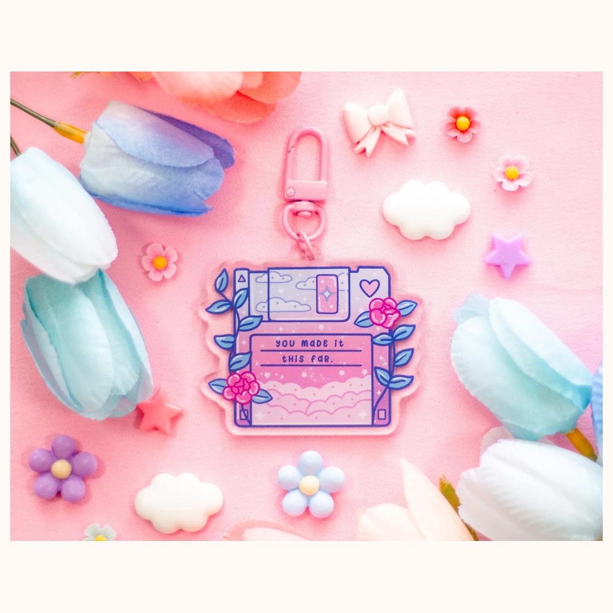
For example, the Floppy Disk Aesthetic Cute Acrylic Charm Keychain can serve as the single focal object. Its listed transparent acrylic charm measures approximately 2.5 by 2.5 inches and has a contrasting pink clasp. Pair that visual with an ivory notebook, a black zip pouch, or a plain canvas bag. The pink hardware then becomes a small echo rather than a demand to add pink everywhere. If the item is being gifted, wrap it with one solid-color paper band instead of printed computer paper; the contrast makes the motif easier to notice.
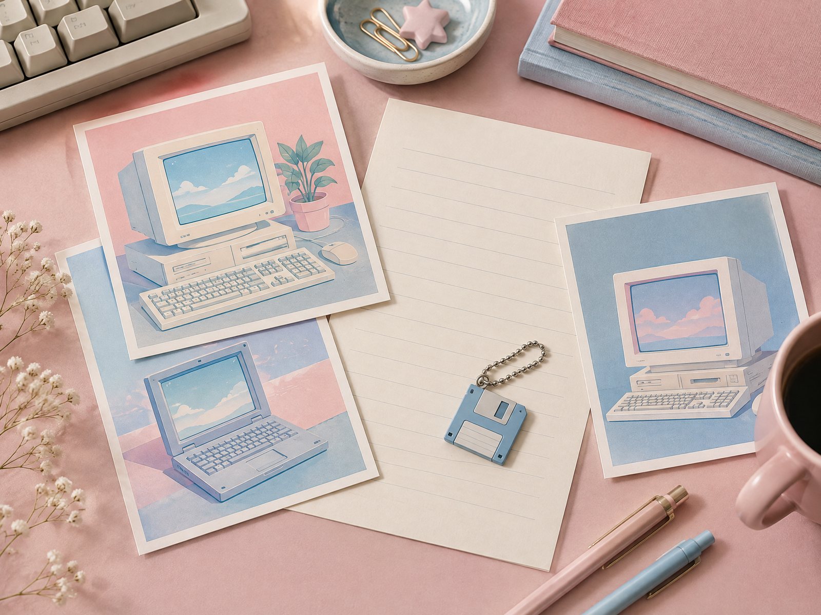
A second restrained route uses the Blue Computer Sticker Sheet as a controlled source of small accents. The catalog describes one 4-by-6-inch sheet containing 23 stickers, printed on matte vinyl sticker paper. That scale gives you options, but not an obligation to use all 23. Choose one or two motifs for a notebook pocket, a removable folder, or a personal planning page, and keep the surrounding surface largely open. If every available icon is applied at once, the eye loses the distinction between the main cue and the background.
Try a quick distance test before committing. Place the item or paper accent where it will be used, step back several feet, and ask what you notice first. If the answer is “a pink clasp and a floppy disk,” the hierarchy is doing its job. If the answer is “a field of unrelated tiny marks,” remove half of the supporting accents. This is an adjustment, not a failure: small motifs become more readable when they are edited.
Another quiet choice is to repeat a geometry rather than a subject. A square charm can sit beside a square notebook label; a rectangular computer image can accompany a narrow bookmark or a horizontal note. The repeated shape creates a visual conversation while allowing the products to remain distinct. Avoid adding a second technology symbol merely because it is available.
Let playful combinations break the rules carefully
A playful combination can carry more color, contrast, and repetition, but it still benefits from a boundary. Set one rule before you begin: perhaps all accents must be blue, pink, and ivory; perhaps every piece must show a recognizable object; or perhaps the theme can occupy only one small zone of the bag. A rule prevents playfulness from becoming visual noise.
One route is to combine the blue computer sheet with a single acrylic charm. Use a larger computer image as the anchor on a notebook or folder, then select one tiny supporting sticker near a corner rather than scattering icons across the cover. The charm can remain on the matching bag handle, where its transparent material introduces a little visual lightness. The objects share a computer reference, but they do not need to be identical in color or drawing style.
A more literal pairing brings the floppy disk into the room rather than onto a personal carry item. The Floppy Disk Aesthetic Cute Aesthetic Fridge Board Magnet is listed at approximately 3 by 2.3 inches, with a magnetic backing and matte finish. Use it to hold a lightweight note or photo on a refrigerator, locker, filing cabinet, or other magnetic surface, or leave it as a decorative anchor. Next to it, place one small computer-themed paper accent on a nearby note—not a whole wall of icons. The separation lets the two references feel intentional: one object is functional on the magnetic surface, and the other is a visual aside.
If you are making a gift, explain the connection in one sentence rather than writing a paragraph about nostalgia. “This made me think of your fondness for old computer graphics” gives the recipient room to agree, disagree, or tell a different story. Do not assume that a tech motif signals a particular age, job, or technical expertise. A person can enjoy the shape of a floppy disk without having used one, and someone who used early computers may prefer a very quiet reference.
Playful does not mean careless about placement. Keep a charm clear of a zipper pull that is used constantly if the extra bulk makes the bag awkward to open. Keep stickers on a surface where the recipient is comfortable decorating. A notebook cover, folder, or removable sleeve can be a safer creative zone than a work device or shared appliance. The choice is part of the design because a conversation starter should not create an unwanted commitment.
Diagnose the common misses and revise the edit
The first common miss is confusing recognition with clutter. A collection of disks, monitors, cursors, cables, and pixel hearts may contain individually appealing images, yet the whole can become difficult to read. Remove everything except the strongest silhouette, then reintroduce one support piece only if the composition needs scale or color balance.
The second miss is choosing by nostalgia alone and ignoring the object’s setting. A bright charm may be delightful on a casual tote but distracting beside a formal work bag. A sticker sheet may suit someone who enjoys changing a journal, while a person who avoids decorating surfaces may prefer a single keychain. Match the expression of the motif to the recipient’s habits, not just to the story you have attached to it.
The third miss is treating product descriptions as proof of a universal use case. The catalog gives specific details, such as approximate dimensions and listed materials, but the right choice still depends on the surface, hardware, and context. Check the listing before ordering, especially if size matters. Colors can also appear different in person because of photography, lighting, printing, or screen settings. That is a normal reason to keep a backup plan—such as choosing a neutral wrapping color—not a reason to make a stronger claim about the design.
Finally, avoid turning the motif into a claim about the shop’s origins or manufacturing. The responsible description is simple: Farouk Book Store curates a catalog in which these retro-tech designs appear. The editorial selection helps shoppers compare a conversation-starting keychain, a small paper accent, or a magnetic display detail. For general context about the shop and its catalog, see About Farouk Book Store. If a specific item, color, or current availability matters, use the site’s contact route to ask rather than assuming inventory or delivery terms.
The best retro-tech edit leaves a little room for the other person’s interpretation. Start with one object that can be recognized at a glance, decide whether the surrounding composition should be restrained or playful, and test the scale in its real setting. A floppy disk can be a memory, a shape, a joke, or simply a neat square. Let that ambiguity do the conversational work.
Related reading: 10 Best Creative Keychains for Thoughtful Gifts, 2026 Stationery Trends: Color, Texture, and Joy, and How to Build a Personalized Gift Bundle